Accessorizing a Dresser

accessorizing-a-dresserwWhen you have a dresser in your own bedroom, you may use the space on top for personal items. But when it is in an extra bedroom or guest room, your accessory choices are probably going to be purely decorative. Here are a few suggestions for making that dresser top look attractive.

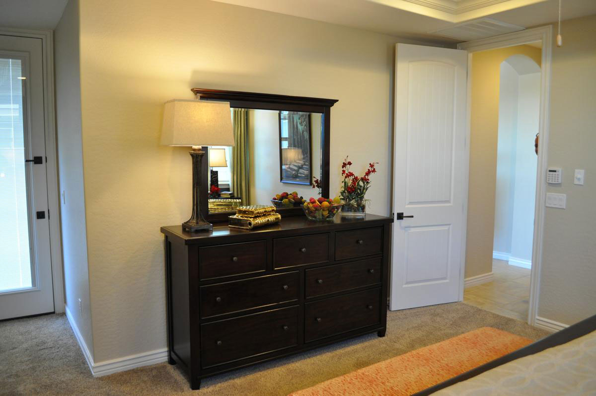
Bring in light: A table lamp like the one in the photo serves several purposes. It can be used to provide ambient light to a room when you don’t want to turn on the bright overhead light. It shines on the surface of the dresser, showing off the gloss of the polished wood surface, and it adds height to the surface display. It can also set the tone for style and color through the lamp’s base and shade.

Vary height: When all of the accessories are the same height, it stops looking like a planned display and starts looking like clutter. On this dresser, the lamp on the left and the flowers on the right add enough height variation to keep the dresser accessories looking interesting across the top.

Bring in color: Red fruit in the bowl connects with the red flowers to add charm. Notice that there is another splash of red across the room by the window that you can see   reflected in the dresser’s mirror. Color helps link the different spaces in a room.

A bit of bling: The basic wood hardware on this dresser demands something shiny on top. The books have metallic covers, creating a spot that sparkles. This sparks up the look of the entire display.

Chances are you have enough odds and ends of accessories to dress up your dressers and coffee tables. Just keep experimenting until you get the look you want in each room.

Personalize your Home: Accessories

8013641_SAre you ready for a change in your home to match the changes in your taste and preferences over time? Accessories provide an opportunity to make a dramatic change in your home with minimal effort and expense.

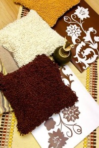
To start, pull all of the accessories out of the room you want to modify. Then set down only those rugs, pillows or other accessories you want to keep in the space. Do you see a trend in terms of color, texture or style? That gives you your first clue to the new look you want. Let’s take a look at two examples.

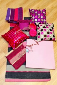
The selection in the photo to the left demonstrates a liking for shiny fabrics, vivid color and contemporary patterns. The photo below, on the other hand, leans toward earth tones and natural elements and patterns. Both can make for a wonderful room, but the personalities will be very different.

7604375_SNow, place those wanted pieces back in the room and take a look for any holes in the space or functions that are no longer provided. Wander through the other rooms in your home to see if you want to move anything around. Then make a shopping list for those items you want to replace.

Remember, you don’t need to buy everything at once. Instead, keep a list of ideas, colors and looks you want, shopping sales and looking for just the right accessory.4754254_S

Above all, don’t rush or settle for something that’s almost there but not quite perfect – look for just the right choice, even if it takes a while. Sometimes the hunt is a big part of the fun.

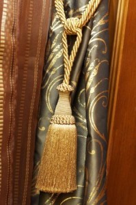
Finally, look for opportunities to add finishing touches that appeal to you. For example, look at the gold tie-back and tassel on the curtain in this last photo. It brings out the gold in the curtain fabric and adds a splash of opulence as well as an additional texture. For a minimal cost, an element such as this can help your space make the statement you want.

Design Tips: Balancing Heights

22021044_SWhen displaying anything – accessories on a side table, a buffet for a party, birthday or wedding presents, the impact is much stronger if you vary heights.

Designers know that getting the right balance of heights makes any visual more dramatic and interesting.

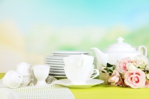
Let’s start with the photo above. The colors of pink and citrus green contrast nicely with the white china and the fabric to the left provides some textural interest. But notice that the difference between the tallest and shortest element is only a few inches. This pretty picture has charm but really doesn’t engage the eye.

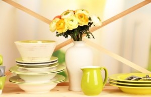
21556061_SIn contrast, take a look at the photo to the right. The colors are actually slightly more limited, but the eye flies across the image thanks to several design choices.

To begin with, the height differential is almost a foot between the lowest and highest elements. The crossed ribbons in the background emphasize the height differences while pulling attention from one part of the image to the next.

14892527_SNow you may have no reason to stack your plates and bowls, but you can use this same concept with accessories in any part of your home. In this last photo, the same concepts are applied to the accessories on a side table.

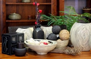
The grasses lying horizontal against the table are over a foot lower than the red flowers that top the vertical vase. The chair backs and the bookshelf in the background provide strong horizontal lines, so the verticals need to come from the accessories.

Finally, notice how the plant provides some nice diagonals to draw the eye the same way the crossed ribbons did in the second photo above. The look is completely different, but the same design concepts combine to make both arrangements powerful and eye-catching.