The Positive Psychology of Color – Part 4: Natural Colors

How to use color to convey in interior design

We are wrapping up our series on the psychology of color with this post about natural colors. In Parts 1-3 we discussed dark, light, and bold colors. Our feature series wouldn’t be complete of course without hues that remind us of Mother Nature. To review, we’ve been chatting about the ways that color affects the way people experience a space.

It is not a must that you give this consideration when deciding how to decorate. But, if you want to create a space that has the wow-factor you experience when you enter a room designed by an interior designer, considering color psychology is highly recommended. Especially if you love natural color because you can create an exquisite space that feels grounded and lovely, but also invigorating! Enjoy!

Chartreuse – artsy, bold, trendy

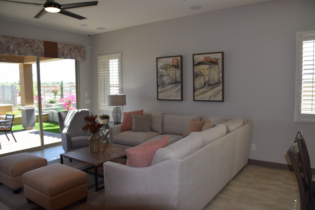
Coral – life force, energizing

Dusty Pink – soft, subtle, cozy, dusky, gentle, composed

Earth Brown – earthy, grounded, steady, solid, rooted, wholesome, sheltering, warm, durable, secure, reliable, natural, traditional

Gold – rich, glowing, divine, intuitive, luxurious, opulent, expensive, radiant, valuable, prestigious

Mauve – wistful, sentimental, thoughtful

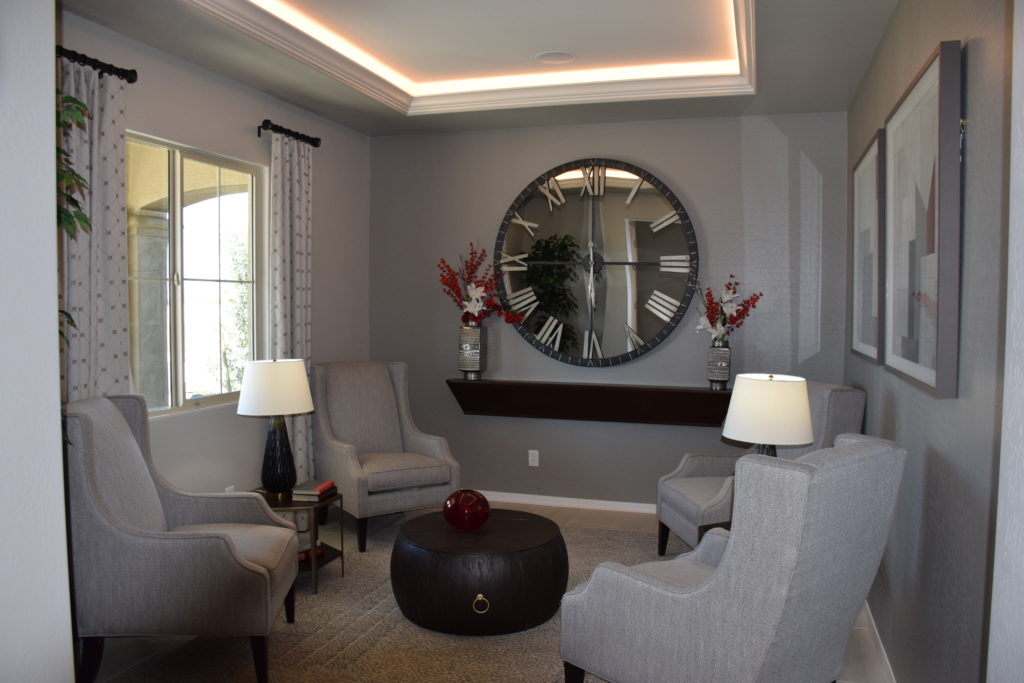
Neutral Grey – classic, corporate, practical, timeless, quality, quiet, neutral, logical, deliberate, reserved, basic, modest, efficient, dutiful, methodical

Olive Green – military, camouflage, safari, classic

Periwinkle – genial, lively, sprightly, convivial, cordial

Silver – sleek, classy, stylish, modern, cool

Sky Blue – calming, cool, heavenly, constant, faithful, true, dependable, restful, content, tranquil, reassuring, trust, serenity, expansive, open, transcendent

Tan – rugged, outdoor, rustic, woodsy

Tangerine – vital, fruitful, energizing

Taupe – classic, neutral, practical, timeless, quality, basic, organic, inconspicuous, understated, modest

Terra Cotta – earthy, warm, country, wholesome, welcoming, abundance

We hope you enjoyed this series on the Psychology of Color!

The Positive Psychology of Color – Part 3: Bold Colors

How to use color to convey in interior design

Now that we’ve discussed both light and dark colors it’s time to step up the excitement and learn how to use bold colors to create a mood in a room! As mentioned in Part 1 and Part 2, color has a dramatic effect on space. It influences energy, emotional response, and overall enjoyment. Perhaps you’re already savvy or perhaps this is your first exposure to this method. Either way, our series of guides to the power of specific colors is sure to aid in creating a space that you adore. If your goal is for others to adore it as well then all the better!

An important consideration is to think about the way combining colors changes things. For example, if you use just bright red and bright pink in a room it might feel energetic and festive, but after a while that could seem like too much. So, try incorporating golden yellow so it also feels comfortable. You can control this even further by minimally using the colors that evoke stronger responses, and liberally using colors that are inherently mellower. 

Blue Purple – contemplative, meditative, spiritual, soul-searching, intuitive, mysterious, enchanting

Bright Red – exciting, energizing, passionate, hot, dynamic, provocative, dramatic, powerful, courageous, assertive, impulsive, adventurous, spontaneous, motivating

Bright Pink – exciting, playful, attention-getting, high energy, wild, tropical, festive, vibrant

Bright Yellow – illuminating, joyful, hot, lively, friendly, luminous, enlightening, energetic, sunshine, innovative, aware, surprising

Ginger – spicy, flavorful, tangy, pungent, exotic

Golden Yellow – nourishing, buttery, tasty, sun, hospitable, comforting

Lavender – romantic, nostalgic, fanciful, light

Lime – fresh, citrusy, youthful, refreshing

Red Purple -thrilling, intense, exciting, dramatic, creative, expressive

Tangerine – vitality, fruitfulness, energizing

Turquoise infinity, compassionate, protective, faithful, water, coolness, sky, gemstone, tropical, oceans

Stay tuned for Part 4!

The Positive Psychology of Color – Part 2: Light Colors

How to use color to convey in interior design

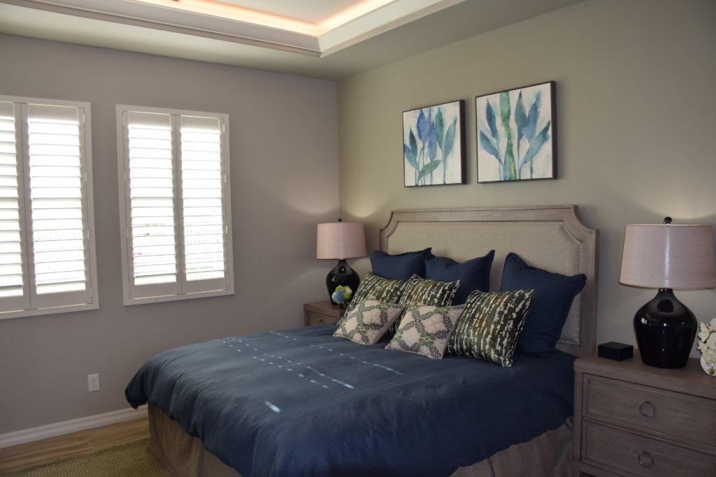
In Part 1, we began our discussion about the psychology of color. Using color to expertly influence the way people experience a space is a very powerful tool. Have you ever visited a model home and been stunned by how serene the bedroom is or how welcoming the family room is? That’s because professional interior designers know exactly how to use color to create a room that makes you say, “This space is absolute perfection!”

Now you can give it try too, by using our handy guide to what colors mean. Have fun with it, and try to get creative by thinking of ways to combine colors for an overall effect. For example, rather than just choose light pink because you want a room to feel youthful, combine it with aqua so it also feels dreamy! The possibilities are endless, have fun!

Light & Medium Colors

White – innocence, purity, clean, new

Amethyst – restorative, protective, peaceful

Aqua – water, refreshing, cleansing, young, cool, dreamy, soft, light

Ivory – classic, neutral, soft, warm

Light Blue – calm, quiet, patient, peaceful, cool, aquatic, clean

Light Pink – romantic, affectionate, compassionate, soft, sweet, tender, delicate, innocent, youthful

Light Yellow – cheery, soft, sunny, warm, sweet, easy going, pleasant

Light Green – calm, quiet, soothing, airy

Peach – nurturing, soft, funny, delicious, fruity, sweet, fragrant, inviting, warm, comfortable, modest

The Positive Psychology of Color Part I

How to use color to convey in interior design

Have you ever thought about deciding the color scheme of your home based on the psychology of color? Certainly, it’s perfectly fine to go with your favorite colors, but one of the great things about knowing how color affects the way people experience a space is that you can create an ideal setting.

This doesn’t mean you have to forego colors you love, but the meaning of color is so effective that it actually changes with the intensity of the color. For example, the color blue can be light, dark, bold, pastel, etc, and each of these is a little different. Selecting a certain shade allows you to create a very specific effect! Intrigued? Keep reading Part One – Dark Colors. Then check out our other blog posts that explain additional options!

Dark colors:

  • Amber – multi-cultural, mellow, abundant, original
  • Black – powerful, elegant, sophisticated, mysterious, bold, basic, classic, strong, expensive, magical, night, prestigious, stylish, modern
  • Brick Red – warm, earthy, established, strong
  • Charcoal Grey – reliable, responsible, accountable, conscientious, resolute, restrained, conservative, professional, classic, sophisticated, enduring, mature, business
  • Chocolate Brown – scrumptious, rich, robust, appetizing
  • Deep Blue – credible, authoritative, basic, conservative, classic, strong, reliable, traditional, service, nautical, loyal, confident, professional, clarity
  • Deep Purple – visionary, wealthy, royalty, prestigious, subdued
  • Dark Green – nature, trustworthy, refreshing, cool, restful, stately, mountains, hushed, woodsy traditional, reliable, money, prosperity
  • Foliage Green – natural, fertile, healthy, balance, life, growth, soothing, harmony, restful, restoration, lively, spring, renewal, lush
  • Teal – serene, cool, tasteful, sophisticated, confident
  • Vibrant Dark Orange – fun, whimsical, childlike, happy, glowing, sunset, hot, energizing, active, gregarious, good natured, spontaneous, optimistic, talkative, jovial, sociable, self-assured, persuasive, animated

Making Your Home Lovely: Part II

Once you start getting a handle on clutter, it’s time to dive into your housecleaning patterns. Do you have a regular schedule for your efforts or just move in when you notice things are going downhill? Most people don’t enjoy cleaning enough to spend the time to organize their efforts, but it’s really worth the investment up front. The following tips will help make your house cleaning easier, faster and more pleasant.

Buy the right tools. Purchase buckets or plastic containers with a handle to hold your cleaning products. You may want to assign one container to bathrooms, a second to the kitchen and a third to the rest of the house. Include the necessary brushes or cloths for each bucket. That way you’re not wasting time finding all of the supplies you need with each cleaning project. It also encourages you to notice when you’re running low on something so you can add it to your shopping list.

Buy a package of shop towels. These are inexpensive and available at warehouse and hardware stores. These are sized at just a bit larger than a washcloth and are made of white terry fabric. You can use these for anything you need to clean. Shop towels are also terrific for picking up spills and wiping up grime on anything from shoes to the car’s dashboard. They’re nicer to use than paper towels and last for years. Expect to use a lot of them, but when you run low just dump them in the washer with some soap and bleach and they’re ready for next time. 

 Your life will quickly become easier and tidier if you include several daily requirements such as cleaning up the kitchen every night before bed. This includes a quick sweep or mop of the floor. Some who batch it might be tempted to put all this off till the weekend, but no one really wants to start Saturday with a cleaning marathon. 

Instead of taking an “all or nothing” approach, how about just throwing in one load of laundry before you leave for work or after you get home? Folding clothes is so much more appealing while watching television. Run through the house with an empty trash bag the day before garbage pick-up and add the kitchen trash bag and you’re finished for another week.

Take one of those shop towels into the bathroom when you get ready for bed at night, and do a quick wipe down of the surfaces. This will make the weekly cleaning less unappealing and faster. A squeegee in the shower can be used to clear the water spots at the end of a wash up, making water spots less of an issue.

Take a close look at what gets in the way of regular cleaning. Do you need to get up fifteen minutes earlier in the morning to put some projects into play before the rest of the family gets up? Do you resent being the one who does all the household chores? Do you just hate the process? Sometimes figuring out your resistance allows you to work past it.

One final tip – build in some rewards and incentives. Pay yourself for every day you meet your cleaning goals. From a luxurious soak in the tub to that new purse you’ve been eyeing. Figure out a reasonable reward for your efforts. With the right combination of carrot and stick, you may soon develop the habits you want to keep your home as lovely as you wish it could be.

Making Your Home Lovely: Part I

Would you like to be one of those people who never minds if neighbors or friends stop by because your home always looks fabulous? You can make that happen with just a few changes to your routine. Here are some suggestions to creating a fresh and inviting home free of clutter and dirt. Let’s start with clutter.

A place for everything: Now, getting here is not easy or fast. It’s up to you to make a commitment to organizing and creating systems that everyone in your family can handle. You might want to start by thinking of your home as a retail store. For example, put all of the office/school supplies in one place, all bed linens in another. Also, invest in a little label maker. You can then label the inside of every drawer and cupboard with a description of its contents, and even label some items – such as the scissors – with their category so it’s easy to remember where to put them back after using them.

Buy and use a put-away basket: Every evening walk through your house and put everything that’s out of place in the basket. Then walk through a second time and put it all where it belongs. This is also a great project to delegate to your kids. You can even charge a fine – a nickel for anything that any family member forgets to put back in its place. Save the money for a family dinner out in the future.

Assign standard chores: These can include everyone – you, kids and spouse – making their own beds, rinsing and putting their own dishes in the dishwasher, choosing their clothes for school the next day, and whatever else you want to see happen daily. Once these habits develop your responsibilities will diminish. This also provides a good discipline for their future lives. 

Understand that none of these steps will happen overnight. This is a work in process and you will always have to make adjustments over time. But the best time to start is now. And maybe every week you’ll see signs of progress.

Be sure to come back tomorrow for Part II!

Decorating the Nursery

Most parents-to-be today find out the sex of their baby before the baby’s arrival.  However, there is a strong minority who wait to know if they are having a boy or a girl until he or she arrives. Whatever camp parents-to-be fall into, decorating the nursery for baby is an exciting process.  And with all exciting projects, it can also be a little daunting.  Do you choose classic pink for a girl? Blue for a boy?  Or do you decorate in a more gender neutral color like yellow or green for future babies who may occupy the nursery? What if you have fraternal boy/girl twins?

While pink for girls and blue for boys continue to be the most popular choices for nurseries, there is a rise in gender neutral decorating in the nursery.  Princess pink can be replaced by yellow with gray and white accents.  Baseball blues might be exchanged for purple and apple green.  There is no limit to the colors you can choose for a baby’s room.  Keep in mind that it is easier to change paint color than replace flooring so you might want to stick to neutral carpet colors or wood floors for the nursery.

If you go neutral on the walls and floor, you can always bring in feminine and masculine touches with the crib bedding, curtains and accessories.  Toys and games as well as art are great ways to personalize a space to fit baby’s personality as well as gender. Neutral will also allow the room to grow as baby grows into a big kid.

Tips for Hanging Artwork

  • Has the time come for you to hang artwork in your beautiful home? Maybe you have even been avoiding it. The process of hanging artwork can seem frustrating and very time-consuming. To help put you at ease while hanging your artwork, we have composed a few tips and tricks to assist you. Let’s take a look! 

Placement:

  • You may find yourself standing there staring at a blank wall and find yourself unsure of where to hang your artwork. If you have only one or two pieces to hang, stand back and visually place in your mind where you want the artwork to hang.  Often people hang art too high; experts recommend hanging your art pieces at eye level. To help, you can physically take the art piece and place it on the wall in your desired spot. With a pencil, draw a short, centered line on the wall at the top of the frame. If your frame has a wire on the back of the art, simply measure from the top of the wire in the center to the top of the frame. Go back to your line on the wall and measure down from the top line to the distance of the centered wire hanger and mark. Erase the original top line, so you do not get confused about the proper placement mark. 
  • If you have multiple pieces of art, start out by placing the pieces on the floor for a symmetrical or asymmetrical look, whichever fits your taste. As you stand back to look at the items on the floor, you can visualize how they will look once hung. You can also move and mix until you get your desired look. 

Techniques for Strength:

  • If possible, drive the nail into a wall stud for the most strength. If you do not already own one, experts recommend investing in a stud finder.  Although in most cases, where you want to hang the art, a stud will not be present. For small and medium artwork, a 1 ½ or 2-inch nail in the sheetrock will suffice and hold securely. Always drive the nail into the wall at a 45-degree angle. This technique ensures a stable and secure hold. 
  • For large pieces of art, purchase hollow-wall anchors with screws.  Anchor sets will match the weight of the artwork. Use a small drill and choose a drill size to match the size of the anchor. Once you drill the hole, tap the anchor into the sheetrock and screw the screw into the anchor.

Straightness:

  • If your artwork is not hanging level and straight, you can purchase some small plastic bumpers that attach to the back of the frame with self-stick tape. What a simple fix for a challenge that will arise now or in the future. 
  • We would love to hear from you regarding any ideas and tips you may have for hanging artwork. What tips and tricks have you learned over the years that could be helpful for other readers? You can leave your responses below in the comment section.

What do color choices say about your home? Part II

Your color choices in your home can say a lot about you and the overall environment. Therefore, knowing when and where to use colors can help you master how each room feels. Combining colors can help influence different feelings as well. As we explored in five colors in part one, we saw how different colors can have significantly different impacts on an environment. Today, we will look at several more common colors used in design themes. Let’s get started!

Purple

Purple is known as a mysterious yet spiritual color. It is a compassionate color; however, it can make for a more calming atmosphere. Using purple is a perfect way to create a luxurious or imaginative environment while being very versatile.

White

This crisp color can make any room feel clean and spacious. White is a heavenly color that is pure and feels very refreshing. It pairs best with cool tones more than warm tones, which is vital to know when designing your space.

Green

If you are trying to add more life to a room, green is the color of choice. It can help revitalize and energize a space. Also, it subconsciously reminds us of plant life, which can help invigorate any atmosphere.

Gray

Gray can steal benefits from both white and black. While sophisticated and classy, it can also keep a room feeling more open and spacious. It is still neutral and leans toward black for more benefits, or you can go light to explore more white inspiration.

Yellow

Yellow is a creative color to use in a room. It is very eye-catching as it is used to capture attention. It will radiate throughout the room, making it feel more optimistic and charming. In essence, you can add more energy to a room by using yellow.

What colors do you use in your own design? There are so many ways we can add color to our homes to help give them life. Knowing these characteristics can help you tailor a room to your specific needs.

What do color choices say about your home? Part 1

Today’s interior design is ever-changing. Many homeowners are being more expressive in their design by adding more personal touches to their homes. In fact, designers believe that our homes are an outlet in which we can express ourselves. The music we enjoy, the way we dress, and even our interior design styles can say a lot about us. However, did you know color has psychological references as well? The colors we are adding to our homes all have meaning. Today, we are going to take a look at some of the most popular colors in homes to analyze what they say about you.

Pink

This color is a compassionate tone. It can be associated with femininity but is slowly becoming more gender-neutral. It evokes kindness and empathy into the atmosphere, and it is known as an innocent color that does not feel aggressive in a room.

Brown

From walnut, coffee, mocha, and even woods, this earthy tone can be expressed through many shades. It feels organic, which makes a room feel more secure and grounded. Being a neutral-based color, brown feels approachable and wholesome in any room.

Red

Red is an extremely bold color! It can make a room feel warmer and add more energy to the space, making for a more exciting environment. However, if it is used too much in a room, it can feel aggressive. Using this color can be great for stimulating a passionate atmosphere or used in another area to make a daring and dynamic statement.

Black

Pure black can feel quite sophisticated. It makes for creating a strong and authoritative atmosphere. It can absorb light, making a room feel darker, which makes for a more mysterious-feeling environment as well.

Blue

Feel confident by adding blue to a room and make a cool-toned space. It is very soothing and evokes calmness and serenity. This peaceful color is perfect for reducing stress and makes for a great area to reflect and relax.

While color psychology is subjective, these expressions are general ideas. Did you know these colors’ psychologies before you read this article? If not, what do the colors in your home say about you? Remember that combing colors or using more versus less of specific colors can influence different thoughts or feelings about your environment. If you are looking to add more color to your home, consider some of these color psychologies. They can help you personalize your space and tailor it exactly how you want it to feel. Make sure to check out the second part of this series to explore even more colors!