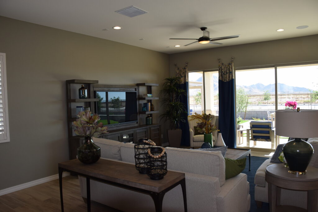
How to Create Tabletop Vignettes

While nice furniture and quality flooring can add style to your home, it is also the smaller details that matter. Perhaps one of the most effortless ways to add sophistication to your home’s decor is by stylishly arranging vignettes on the tabletops and shelves. Creating such grouping is a form of art that, when done correctly, can be eye-catching.

You can use all kinds of accessories to form eye-catching vignettes. Plus, vignettes can be reinvented as the season changes or when you find a new piece or simply at your whim. To help you master vignettes, here are some tips for putting together great arrangements?:

Select an Anchor Piece

Start off by selecting an anchor piece. Your anchor piece is what makes a bold statement. Since this will serves as the center of interest, you must select an item that has value to you. Choose an item that has some visual width and height. Mix up the texture of the items as well. That means hard and soft, shiny textured items can all be displayed together.

Give Consideration to Visual Structure

Visual structure is everything; therefore, arrange items into a form. This type of structure will prevent things from looking thrown together. The shorter objects should be positioned at the outer edges. Linear arrangements only work if there is a relationship between the selected pieces. There should also be a hint of contrast.

Use Odd Groupings

To make a dramatic impact, try arranging similar objects in odd number groupings. For instance, objects arranged in groups of three and fives are more visually appealing.

Do Not Forget the Background

The background plays a vital role in the display. Busy wallpaper can cause the arrangement to look chaotic. It is vital that the background complements and unify the vignette. White walls are a neutral background. If you want to dress things up a bit, mirrored backgrounds can increase visual interest by magnifying light and color.

Build Around a Lighting Source

Your vignette will likely go unnoticed if you build it in a dark corner. Therefore, it is best to select a location that is well-lit so that your guests will be able to get the full effect of your arrangement.

We hope you found these tips and tricks helpful! Be sure to subscribe for more expert advice.

Ideal Measurements for the Perfect Dining Room Layout

Are you in the midst of decorating your dining room? The key to creating the perfect dining area that is both highly functional and well designed is having the appropriate measurements for the space. In fact, taking the ideal measurements for the dining room ensures that you do not form a layout that is uncomfortable and awkward to navigate. Keep in mind that you will be having meals with your family and entertaining in this area, thus understanding the dimensions of the room will help you create an enjoyable dining experience.

Understanding Dimensions

Planning for the perfect dining area requires that you are aware of the dimensions of the dining area. You will need to select furnishings that allow for clearances to maneuver, and you should also focus on purchasing pieces that are proportionate to the size of the dining room. Here are some standard measurements for the average dining table:

  • Rectangular Dining Table: Of course, the contour and size of the dining area should determine what type of table that you select. Rectangular-shaped dining tables will fill up narrow dining areas. If you desire a rectangular dining table, then you should consider one that goes with the dimensions of the room. Start off by measuring the length and width of the table. A standard size rectangular dining table measures about “36-40” inches wide. Depending on how many people you want to seat, it measures as much as 60” inches long to seat up to six people.
  • Round Dining Table: Round dining tables are a space-saving option because they often lack square corners. Round dining tables are ideal for smaller-scaled spaces. An average round table is approximately 48 inches in diameter. If you are considering adding a round table to your dining room, you will want to select something that can accommodate your desired amount of diners.

Walking Room

Whatever type of table you select, to furnish your table, be sure to leave at least 36 inches between the table area and the walls. This will give you enough space to move throughout the room.

Place Setting

What about the diners? When eating at the table, it is essential to make sure that there is enough space between each place setting. Each place settings should be at least 24 inches apart. This gives the diner elbow room and at least 20 inches of legroom underneath the table.

We hope you found this article helpful and for further assistance, be sure to check out our other blog posts here.

Purchasing The Perfect Dining Room Chairs

From casual breakfast nooks to elegant formal dining spaces, dining rooms come in all shapes, sizes, and styles. Everyone knows that one of the most essential elements of a dining room is the dining chairs. From traditional dining sets to mix-matched dining chairs, the design possibilities are endless. But before you invest in dining chairs, it is important to consider these essential factors:

  • Is it the right height for your dining table?
  • Is the fabric durable and easy to clean?
  • Is it comfortable enough for the type of entertaining you like to do?

Digging deeper, we created a guide for choosing the best dining chairs for your dining space. Let’s take a look!

Design

While it has become trendy to pair a contemporary with traditional chairs and vice versa, focus on finding pieces that share a common design element. For example, if you have opted for a square-shaped dining table, you will want to make sure the chairs feature the same shape. Or if the table has an intricate design on the legs, you should consider purchasing chairs with a similar look on the legs to create design consistency.

Dimension

The standard size of a dining chair is approximately 18 inches in height while the average dining table sits at 30 inches. As a general rule of thumb, you will want at least 12 inches between the top of the seat and the bottom of the table. Also, the chairs should match the scale of the table. So if you have a grand dining table, you will likely want to invest in bigger chairs.

Avoid purchasing chairs that are less than 17 inches narrow. Why? Really, cramped seating will not provide an adequate amount of support for your guests and will likely be uncomfortable. To create the ultimate comfortable experience, look into chairs that are 20-24 inches deep.

Surface

Deciding whether to invest in an upholstered chair or select something with a natural, easy to clean surface can be difficult. With upholstered chairs, you can expect someone to spill something on it sooner or later; therefore, the question regards to maintenance and upkeep. If you want that upholstered feel but low maintenance, consider leather chairs. Fabric chairs tend to be more challenging to clean than leather seating.

For more professional decorating advice, visit us weekly at Fulton Homes. Thanks for reading!

Decorating The Dining Room

Since the dining room is where you share meals and quality time with your family during the week and where you host your dinner parties, it is essential for this area to be inviting and full of warmth. As you take a look around your current design, is it time to breathe a new life into your dining room? If you said yes, you would want to consider several factors such as color, style, and function. Below are some tips that can inspire you: 
 
Lighting Scheme
Modernize the dining area by updating the lighting scheme. If you are interested in trying something edgy, try installing industrial-style lighting. You can then balance the look by using furnishing that embraces natural materials such as a distressed wooden dining table combined with wicker chairs. 
On the other hand, if you are set on embracing a more classical look, then it is time to go chandelier shopping. Chandeliers are a great way to create an area of interest. The width of the chandelier should be approximately ½ to ? the width of the table and at least 30-34 inches above the table. You will find that chandeliers help create a focal point in underwhelming spaces and instantly add elegance with their charming demeanor. 
 
Chairs
If you already have a set of chairs, you can merely freshen them up by adding slipcovers overtop of them. Chair slipcovers allow you to easily change the look of a chair without taking away from the design. If you want to get fancy, you can have custom slipcovers made with monograms on them. You can even purchase standard slipcovers in all kinds of styles from popular furniture shops. 
 
Add Just A Pop of Pattern
A touch of a pattern is great for brightening up dull spaces. You can add a bit of pattern to the windows with some modern Roman shades that feature a modest pattern. You can also opt to add a design to the walls with a striped paint or even consider installing a wallpaper. Today’s wallpaper is a far cry from your grandmother’s dull wallpaper. These days they are manufactured in fun graphics and geometric patterns to add flair and creativity. 
 
Colors
Do not be afraid to use bold colors. In fact, by doing so, you can make a big statement. Dark colors can help portray an elegant feel whereas softer, neutral tones can create a homey atmosphere. Whatever look you are trying to achieve, you can accomplish it with the right paint palette. 
 
For more tips and tricks, check back weekly!
 

Ideas for Decorating a Vaulted Room

Decorating a vaulted room can be an exciting undertaking. A few key things to consider when decorating spaces with vaulted ceilings are artwork, curtains and lighting. Here are a few tips for each category.

First, hanging artwork is a great way to decorate a room with vaulted ceilings. There are a few tricks for hanging artwork in a room with an arched ceiling. First, it is important to mimic the ceiling line to complement it. Also, keep wall art around eye level. Finally, vertical rather than horizontal artwork works better with a vaulted ceiling.

Next, curtains are excellent for rooms with vaulted ceilings. There are many options for how to hang them from covering the whole wall or framing windows. There are also many choices when selecting curtains like color, fabric style, and length. Fabric styles vary and have various benefits. For example, polyester is affordable, sturdy and long lasting. Cotton curtains are another option; they drape well, and go well with a modern décor. You can choose sheer cotton for an airy feel or a tightly woven cotton for more privacy. Silk curtains also drape well, and are heavier than cotton. Silk curtains can be damaged by too much sun exposure, so it is important to protect them; they also require dry cleaning, which is something to consider. Linen curtains are also dry clean only, and drape nicely. Natural light easily seeps through the fabric, as it is sheer. Velvet curtains are always a classic choice. They look elegant, and insulate well. Velvet is a heavy fabric, and is a good option for drafty rooms. Finally, lace is another option. Because of the sheer nature of the fabric, lace curtains provide an airy light feel to a room.

Finally, lighting a room with vaulted ceilings is another key feature to make the space look its best. There are several options to choose from, and it is recommended that one layers the lighting by choosing several options. For starters, pendant lights work well. They are often suspended by chains or rods. There are a wide variety of sizes and shapes from which to choose. Another option is track lighting; track lighting is often used with a sloped ceiling. This option allows for greater control over the direction of the light source. The lights situated on the track can be manipulated to face multiple directions at one time. Recessed lighting is also a good choice. Recessed lighting is an excellent choice for adding ambiance to an environment. It can be used to spotlight artwork, or a specific area of the room. Finally, wall lighting is also effective. Wall sconces are an excellent choice in a room with a vaulted ceiling as they can direct light in multiple directions highlighting the height and depth of a room with a vaulted ceiling.

These are a few ideas to help you decorate a room with vaulted ceilings. Please contact us if you have any questions!

An Inviting Dining Table

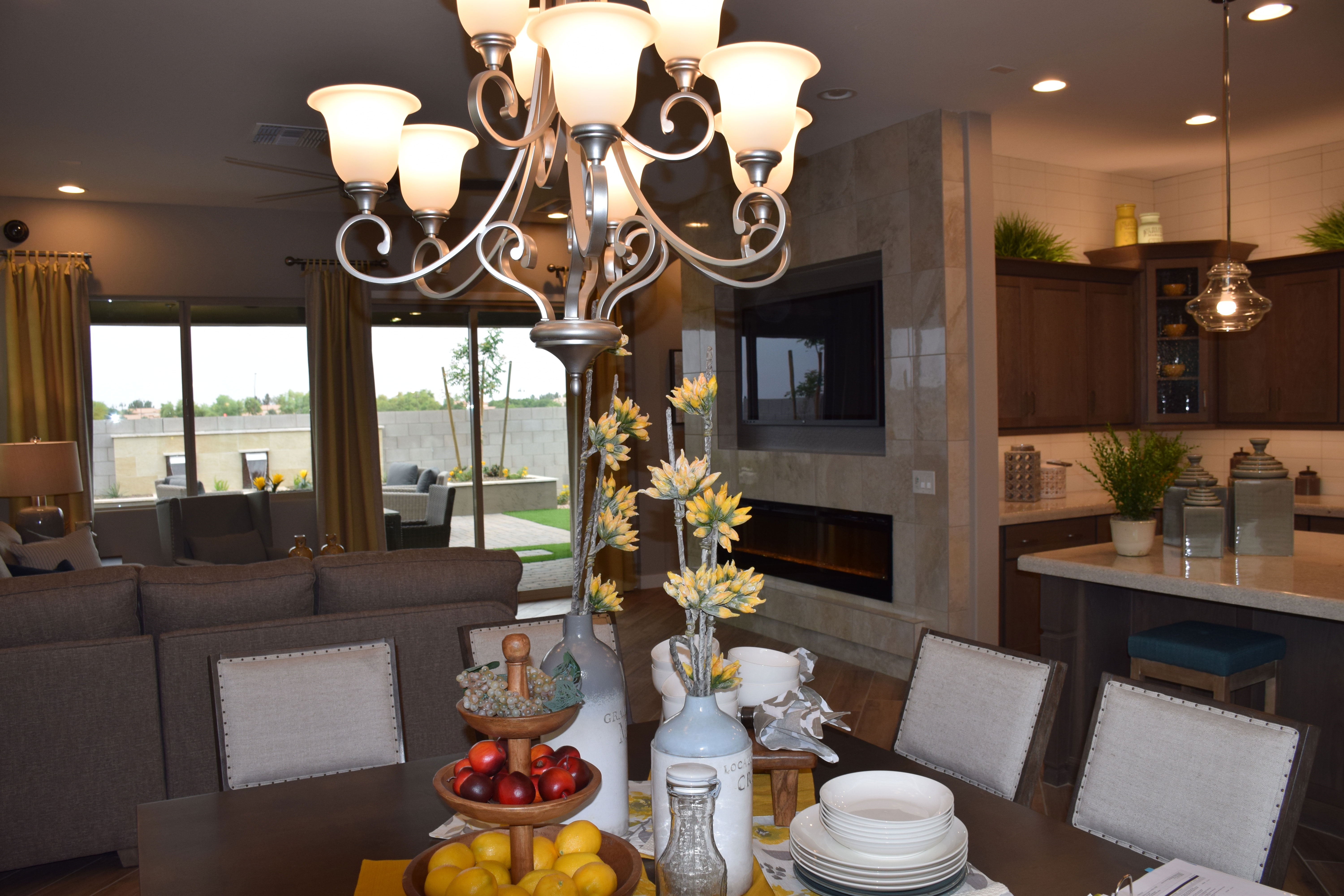
wWarner-Groves-at-Morrison-Ranch-065 - CopyWhen you’re planning the look of your dining area, there are a lot of elements that make the space inviting. Here are a few tips to make your dining area catch people’s attention.
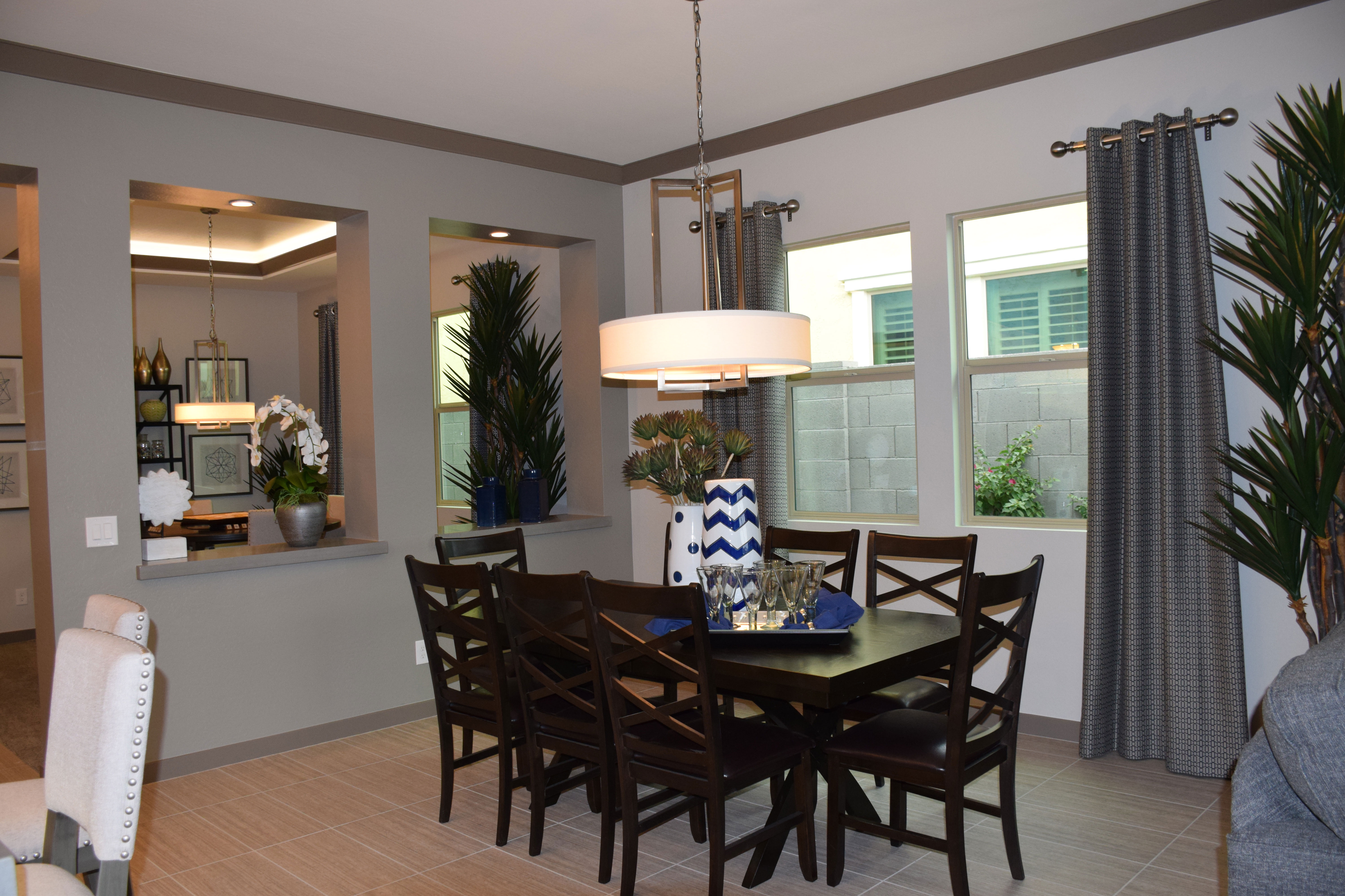
The perfect chandelier: More even than the table itself, the right chandelier makes a dining space stand out. You want something that reflects the style of the space. You also want to make sure that it is the right size for your dining area and your table. It should also hang at the right height – not so low that it shines in your diners’ eyes, but not as high as most ceiling-mounted fixtures. Generally a chandelier should hang 32-40 inches above the table. It should be just large enough to light the table’s surface without lighting the diners.

The right dining chairs: If you want your guests to linger after dinner for an enjoyable conversation over dessert and coffee, pay careful attention to your dining chairs. Make sure they will be comfortable for at least an hour or two. Look for nice padding on the seat and maybe the back, and make sure the backs lean so that people aren’t forced too upright. Be sure to sit in any potential dining chairs for more than a few minutes before you make your choice.

Accessories that add interest: When you are not actually dining, look for a table centerpiece that helps link the table to the chandelier. These tall flowers do the trick in this photo. But when you have guests for dinner, put this arrangement on your island and keep any centerpieces low enough to converse across the table.

Colorful table linens and white plates: This rule is not written in stone, but many chefs swear that food looks better on white plates. Color in your table linens adds interest and personality to your table.

Daring Lighting Makes a Room

wWarner-Groves-at-Morrison-Ranch-009The dining area often provides the best opportunity to showcase daring lighting. If you are tired of the classic chandelier look, today’s light fixtures offer you plenty of interesting and contemporary alternatives. This light is a good example.
In the past few years, shades have grown in popularity. They help keep light evenly distributed and provide the opportunity to add a fabric element among all the metal. But this shade is far from standard.

First, the proportions are unusual. Only about six inches tall, the wide circle feels almost sculptural. This is helped by the dramatic rectangular design elements in the light itself. There’s an echo of some mid-century modern fixtures but with a styling that stays true to today.

Notice the second lamp just like the first one in the game room. Having two of the exact same lamps with almost a mirror look adds to the daring feel of this lighting choice. This particular light has a dramatic impact when viewed from a distance.

Lighting is a good way to bring style into a room. When you choose just the right light for each space, your choice can add a strong element of design. In this case the light is clearly the focal point for this dining area.

Fulton Home models provide a great venue for viewing some of the best of today’s lighting choices. Visit our new models at Warner Groves in Morrison Ranch to see this and other interesting and unusual lighting options.

Inviting Space for Family to Gather

inviting-space-for-family-to-gatherwWhen you’re choosing your next home, be sure to look at more than room size, the number of bedrooms and bathrooms, and the amount of storage. Take the time to think about how you and your family will really use the home.

Do some members of your family work from home or have demanding school requirements? Then be sure that you have planned for space that allows them to work or study quietly with minimal distractions. Do you and your spouse enjoy having a cup of coffee together in the morning to discuss the day’s plans or maybe a quiet conversation in the evening to relax before getting ready for bed? You may want to take the time to scope out where you can comfortably have that rendezvous.

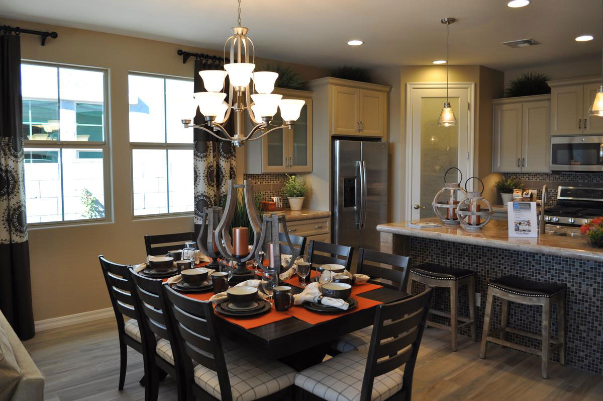
And if your family values its together times around meals, this kitchen and dining area may be ideal for you. With island seating for quick short-order-cook breakfasts and a roomy table near the kitchen for full-scale family-style dining, this space is suited to whatever meal patterns your family finds comfortable.

Does everyone gather, working together to get dinner ready? There’s plenty of room and counter space for lots of helpers. Maybe some of the younger ones are up for after-school snacks. That island is the perfect place to munch while sharing highlights of the day with other family members.

There’s plenty of space, plenty of light and plenty of seating for everyday eating and larger holiday events. How about staging a buffet on that lovely island? Take a closer look at this kitchen, designed with socializing in mind, at Fulton Home’s Cooley Station community.

Balance Formal Casual Traditional Contemporary

balance-of-casual-and-formal-traditional-and-contemporarywIs this dining room formal or casual? Traditional or contemporary? Actually, it has elements of all four. Let’s take a look at how it’s put together and why it works so well.

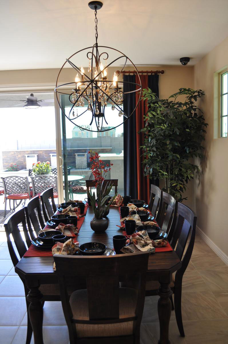
Formal: The basic chandelier has classic lines, even crystal pendants, to maintain a formal traditional theme. The table also shows its formal roots with the dark-wood finish, turned legs and detailed edging around the top.

Casual: the choice of placemats and napkins in bright colors and patterns rather than the more classic white tablecloth approach says casual. Also, choosing a simple fabric for the dining chairs’ upholstery maintains a more casual feel.

Traditional: The dining table and chairs as well as the chandelier’s basic lines are classic and traditional but…

Contemporary: Choosing the circular frame around the chandelier takes it out of the last century and bumps it firmly into this one. The stoneware is also modern in line and glaze.

Overall, this dining room combines many design approaches into one cohesive whole. It works for several reasons. The proportions fit well together and there is a nice mix of dark and light. It takes courage to blend these different approaches to décor together, but when it works – as it does in this case – it is a pleasure to see.

Bring Color into your Dining Room

web-bring-color-into-your-dining-room-blogMany people are hesitant to choose color for large furniture pieces for fear that they will tire of it or that it will go out of style. But you can bring temporary  color into your dining room with very little effort or expense. Let’s take a look at some of your options.

Slipcovers: The two chairs in this photo are upholstered in a fun coral, rust and gray pattern, but you can get the same result with slipcovers. Choose chairs in a simple style and you can have slipcovers made in a variety of fabrics and colors. By only covering the chairs at each end of the table, you get a nice pop of color without as much expense or trouble.

Table Linens: The placemats and napkins on this dining table match the colors on the two chairs, connecting everything together. This enables you to carry your colors across the table, once again with the flexibility to change your color scheme to match the season or your mood.

Centerpiece: Whether you use flowers, candles or other choices, your centerpiece can pull in all of your colors and integrate your color scheme. If you plan a buffet as part of your dinner plans, be sure to bring the colors into that area also.

Any dining room can be enhanced by adding temporary bursts of color. Be sure to look for opportunities to include color when planning your entertainment events.