When it comes to interior design, traditionally, metals were never supposed to be mixed throughout the design. However, interior design is always changing. New generations want to change the traditional styling of their parents and put their own flair on the design industry. While tradition is great, the new trends can bring forth many significant styling advantages as well.
Does your home have a common metal theme throughout it? Perhaps, you have all stainless-steel appliances in your kitchen. Well, if you are looking to change with the times, consider mixing metals in your home’s design. Here is everything you need to understand about metals in order to properly mix them in your home design:
No More Than Three Metals
When it comes to mixing metals, it is very similar to painting a room. The most effective approach is no more than two or three metal variations. You can have one primary metal and choose an accent metal, or you can choose to have two secondary metals and an accent.
The easier approach is two, but mixing three can be aesthetically pleasing as well. Try to use your primary metal in a variety of areas throughout your home. Perhaps, your kitchen has stainless steel appliances. This may be your microwave, sink, range, refrigerator, and dishwasher. Now, consider adding your secondary metal to other areas of the room. Maybe a different metal on the handles on your cabinets and doors while including a coordinating metal chandelier and faucet to the design.
Mixing Different Metals
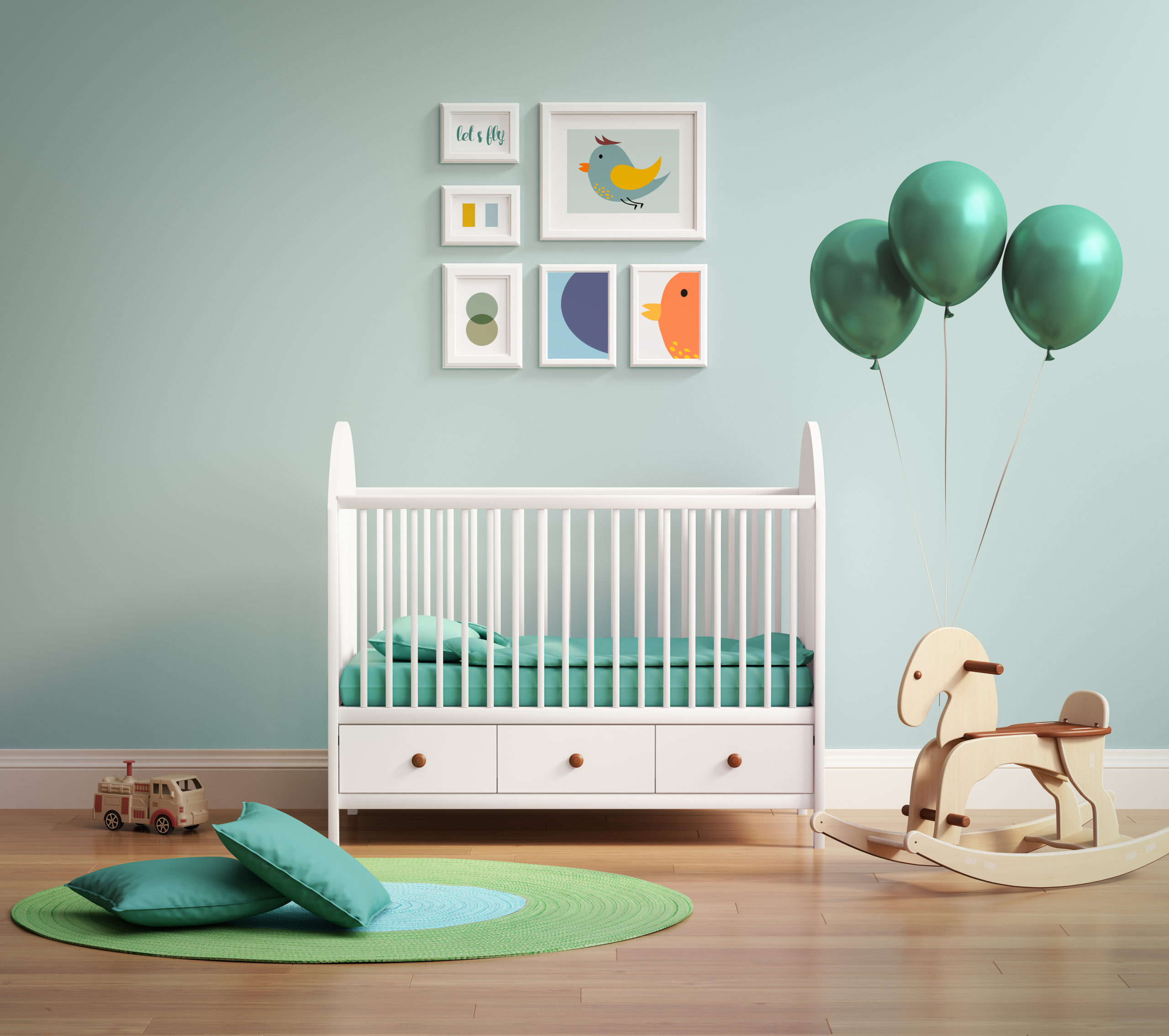
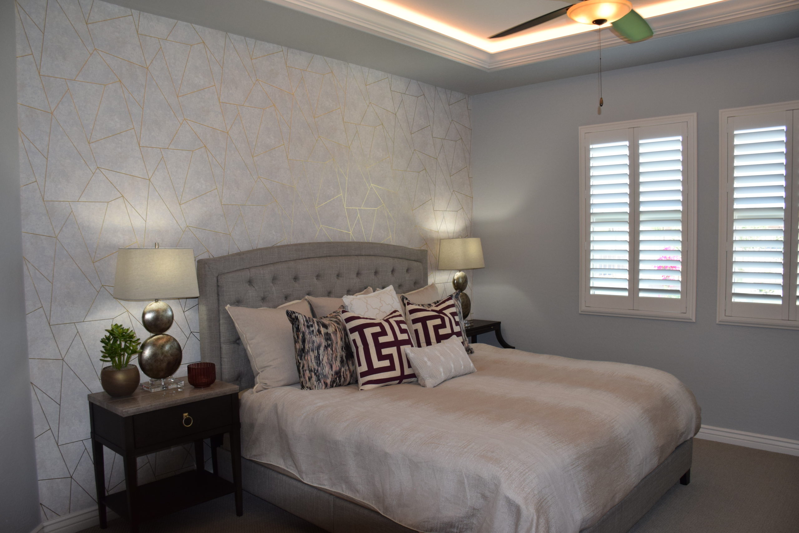
Different metals can influence the tone of a room. Just like colors, there are cool, warm, and neutral metals. Warm metals consist of brass, copper, and gold. Cold metals are aluminum, stainless steel, and silver. Whereas neutral metals can be black metals or cast iron. When adding your accent to a room, select a different value metal to give it more of a pop to your design. For example, if your room is full of gold (warm-tone) picture frames, light fixtures, and bar stools, try adding some silver (cool-tone) accents to the room.
Metal Finishes
Metal finishes can work great in different design styles. There are several different finishes to choose from when selecting metals in your home. Weathered metals can be used to enrich an atmosphere. Hammered metals are great for adding some texture to Rustic or Farmhouse designs. You can even try applying brusheed metals to Eclectic homes. Polished metals are used in many Modern-styled designs and can help enhance yours as well. Yet, a satin finish may be more Traditional. Knowing the different metal finishes and how they affect your home may help you select the right finish to tailor to your design theme.
Mixing metals is becoming more common. Adding a variety of metals to your design can help really add character to your design. There are so many ways to incorporate these tricks into your home, even from decor to furniture. How will you end up mixing metals in your design? Let us know below in the comment section. Thanks for reading!