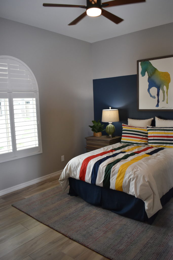
Looking for ways to transform a blank canvas? A split complementary color scheme will no doubt add great contrast to a room which instantly brings interest and variety to your space. However, the downside is that you can end up with a design that looks busy or messy. If you’re interested in doing something different with your home’s decor, this article will show you how you can pull this off successfully.
What Is A Split Complementary Scheme?
In a split complementary color scheme, you’ll be using three different colors. This decor consists of two complementary colors and then the color that sits opposite from the complementary color on the wheel. For instance, yellow and green are complementary colors. Violet is the split complementary color of yellow. Usually, this palette will consist of two warm colors and a cool tone. However, you can adjust the temperature balance as you see fit. If you want to create a warm and welcoming atmosphere then you should use more of the warmer colors in your decor. Paint your walls and use this color in your furniture upholstery. On the other hand, if you prefer to set a cool mood then you would do the opposite.
Clashing of the Colors
Yes, using a split complementary scheme can be challenging especially if you’re not particularly skillful at using colors. To avoid a harsh clashing of colors, which can make for an aesthetically unpleasing look, make sure you don’t overdo the contrast. For a sophisticated look, you can tone down the hues of the opposite color. You can even use more of the two complementary colors and the third color sparingly.
Example: Blue, Violet, and Orange
Blue and violet are complementary colors. In a split complementary design scheme, blue and violet are the dominant colors. Orange should be used sparingly as an accent color to make your space come alive. For instance, in a bedroom, you could consider painting the walls a pale violet and covering the arches in blue. Perhaps your bedding would also be violet or blue and you can add orange pillows as an accent.
