Garden Herbs

Summer is in full force which means cookouts, barbecues, and picnics! All of these activities can be improved with herbs right from your home garden. Do you not have herbs in your home garden? No worries, we have the perfect list of herbs for you to plant: 


The Six Must-Have Garden Herbs: 

  1. Basil. One of the most popular herbs that homeowners grow is basil. It is rich in nutrients and full of bold flavors. Basil is one of the most versatile herbs because it can be used fresh or dried! The meal possibilities are endless with basil from homemade pesto to basil tea! 

Pro-tip: While you are growing basil in your garden, pull out any flower stalks that begin to grow. By doing so, you will have the best-tasting basil. 

Meal Idea: There is nothing like a homemade margarita pizza with fresh basil. You and your loved ones will delight in the pizza’s simple yet bold taste. 

  1. Chives. Not only is this herb delicious, but it discourages mosquitoes and other unwanted insects from entering your garden bed. Chives are light yet tasty. Chefs compare their delicious taste to onions. 

Pro-tip: When preparing to take your chives to the kitchen, try to keep 1/2 inch of the chive’s stub in your garden to help keep it growing properly. 

Meal Idea: Want an easy dish to bring to your next party? Try making homemade sour cream and chive dip.

  1. Cilantro. You will get two opinions on cilantro: I love it or I hate it. People usually have very strong feelings about cilantro. If you are a cilantro lover, you must add this unique herb to your home garden. Plus, cilantro has several health benefits from aiding in digestion to reducing inflammation. 

Pro-tip: Throw out any dried, brown leaves from your cilantro plant to stimulate a healthy growth.

Meal Idea: Guacamole can be savory with a dash of cilantro, lime juice, salt, pepper and diced tomatoes. The cilantro helps bring all these flavors together into an enticing Mexican dish. 

  1. Mint. Not only will its smell delight your senses, but mint’s versatility makes it the perfect herb. You can add mint into your favorite drink or even a sandwich. Mint can be delicious in a variety of different dishes, just try it out. 

Fun fact: Mint has beneficial properties that can be used to help to relieve headaches or sinus infections and can help with digestion. 

Meal Idea: In a water bottle, place a couple pieces of mint with sliced strawberries. The flavors will help you drink more water and aid your digestion. 

  1. Parsley. The herb that takes away bad breath and tastes delicious. You will notice that parsley has a more bitter taste than the other herbs, but it works well in all types of dishes. 

Meal Idea: How delectable does grilled steak with parsley sound? The next time you prepare a meal on the grill, try adding some parsley as a delicious garnish. 

  1. Rosemary. You will love this herb because of its versatility and bold flavors. Rosemary can be paired with meat, vegetables, nuts or bread. 

Meal Idea: Add rosemary sprigs to some olive oil and voila, you have a mouth-watering dipping sauce for your bread. 


Having an herb garden makes cooking all the better. You will love the fresh flavors and spice your herbs can add to a meal. 


Kitchen Organization 101

A kitchen holds a lot of importance in a household. A kitchen is so much more than just a place where you cook. Think about the memories you have made in the kitchen. Whether you were baking cookies with grandma or preparing your first meal in a new home, a kitchen can hold a lot of significance. Let us treat our kitchens with the respect they deserve by taking care of them. A clean, organized kitchen can allow you to make the memories you want with your friends, children, spouse, etc. So let us organize our kitchens to get the maximum use out of them: 


  1. Take it all out. Remove everything from your cabinets and drawers. There may be some items in there that you did not even know you still owned. Separate the items into different piles: keep, donate, and trash. Chipped, broken items can go into the trash and unused, good condition items can be donated. 
  2. Sort items. Make your kitchen more logical and convenient by sorting items based on what they are. For example: group your glassware together and put them in one area of the kitchen. 
  3. Make it convenient. Think about the layout of your kitchen and place items by where they can be easily used. For example, place baking items near the oven for easy access! Store items that are not frequently used up higher and items that are used daily within reach. 
  4. Label items. If you like to make homemade dressings, jams, or sauces, make sure you label the container with the date and what product is inside it. This can avoid future confusion for you and your family. 
  5. Place lids on top of their container. This will be a lifesaver when you are trying to store your leftovers. Whenever you wash a container and lid, make sure to put them back together for easy use in the future.  
  6. Divide the drawers. Drawer dividers can be extremely helpful for cooks because they save us from having to dig through drawers. You can divide your silverware, utensils, etc. It will help you find items fast and remove clutter. 


Time to get cooking and make some amazing memories! What are some of your favorite memories you made in the kitchen? Feel free to comment in the section below: 


Painted Cabinets Make Kitchen Light and Bright

kitchen-2w

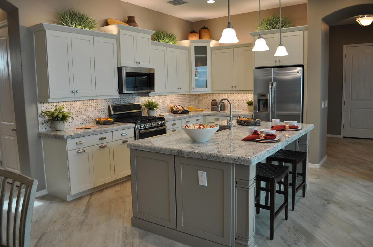
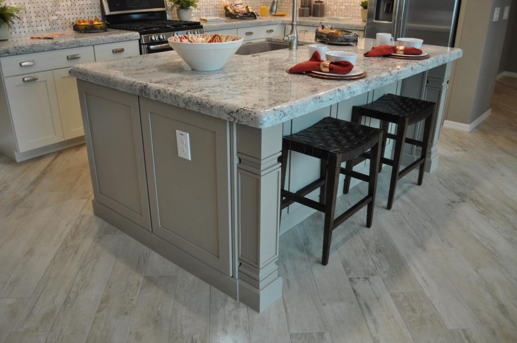
When you’re designing your new Fulton Kitchen, it’s worth considering painted cabinets. They add a light and inviting look to your food preparation space, and keep everything feeling light and bright. With lighter countertops and under-cabinet lighting like this kitchen in the Caravan model in Central Vermont at Cooley Station, the entire room is designed to create a supportive mood that makes it easy to spend time in this kitchen.

There are still a few darker elements for contrast, like the oven and microwave and the comfortable stools at the pull-up eating area on the island. Accessories also add nice pops of color. But the overall mood is light and easy on the eyes.kitchen-1w

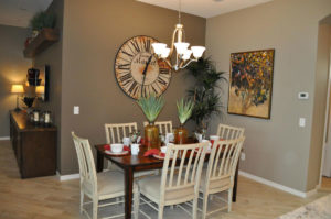
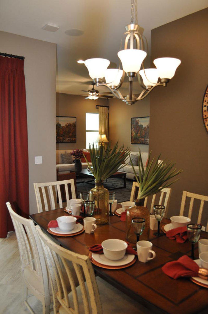
Notice how the accent wall, shown at the back of this photo going into the dining area, provides another contrasting element. At the same time the white dining chairs connects this space with the kitchen.

This is a smart connection between the two spaces, linking them both while still providing a source of much-appreciated contrast. The darker wall also supports a cozy ambiance which is appreciated in a dining space. Notice also the colorful tablescape where the accessories link it to the island. These choices make a home look more like a designed space rather than creating a more scattered feeling. kitchen-6w

Don’t be afraid to mix dark and painted wood. You can see how well it works with this dining table and chair set. The shabby-chic effect on the painted chairs keeps them from seeming too matchy-matchy with the cabinets while still creating a link. While the painted chairs bring the painted kitchen cabinet feel into the space, the dark stained wood echoes other pieces used in the rest of the home. This type of mixing allows you to add just a few new pieces without having to discard the bulk of your furniture if you choose to go in a different style or color direction with your new home.

kitchen-5w

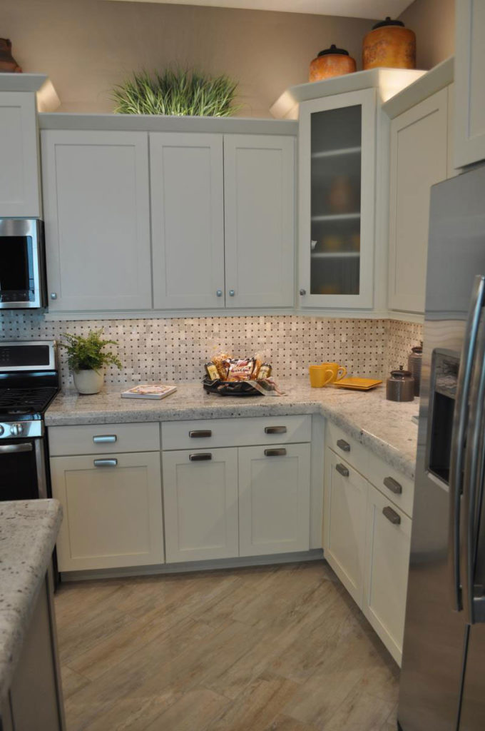
Take a look at another way this kitchen provides contrast without going dark. The addition of one glass-fronted cabinet in the corner adds a welcome and interesting break in the line of top cabinets. Both the height difference and the contrast of the glass add a welcome change in the design. And limiting the glass front to only one cabinet is also a smart budget strategy, because window doors are more expensive. They also require you to maintain tidier cabinets, which can be a nuisance.

kitchen-4w

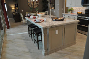
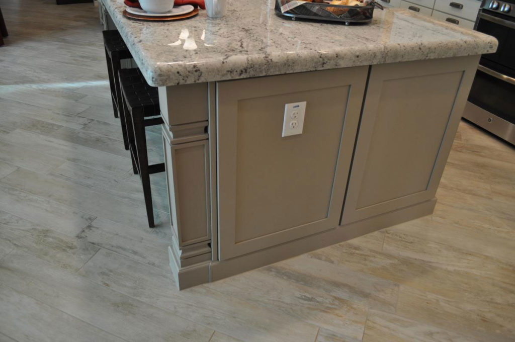
In another opportunity to add an interesting contrast, the island is a soft grey/taupe rather than white. This color works well with the chosen countertops and the flooring, yet it helps the island feel like something special. Choosing a different cabinet color for your island is daring, yet as you can see it can work well.

One reason this color choice works is because the same taupe is echoed in the kitchen’s backsplash. If you notice, the mid-range tone is a close match for the island cabinet color. When you can find ways to make those kinds of connections, you will end up with a kitchen that feels integrated and well thought out.kitchen-3wIt’s interesting to realize that there are actually three fairly strong patterns present in this kitchen: the flooring, the countertops and the backsplash. You can see all three in the photo above. This could easily feel like too much if the contrast within or among the patterns was stronger. Imagine these same patterns in vivid reds and oranges! But because they are all gentle and light in color, the number of patterns isn’t overwhelming. In fact, you almost need these patterns to keep the kitchen interesting. In a way, the patterns take the place of a stronger light/dark contrast you would see in some other kitchens.
Here’s the final interesting design decision with this light bright kitchen. The rest of the open floorplan was designed to focus your eyes in that direction. The diagonal flooring draws the eye toward the kitchen, and the brightness of the space contrasts with the mid-range colors of the dining and family room to draw you toward the light just like a sunflower turning to face the sun. kitchen-7w

The rest of the home is warm and welcoming, with other white elements that mimic the light kitchen such as the sofas in the family room as you can see above. But linking it all, the heart of this home, is the light and bright kitchen, made for a family to live in, eat in, and spend time together in, and above all, enjoy. And that’s the best use you can make of a kitchen, isn’t it?


Your Kitchen and Artwork

The kitchen isn’t traditionally a place where you would think to hang your artwork but that doesn’t mean it should be overlooked. Art is a great way to add visual interest to any space and can bring a new warmth to your kitchen. Perhaps you have a favorite piece that will make washing the dishes just a little bit easier because you have that in your kitchen to look at. Or maybe you want to make a change to your kitchen without breaking the bank or painting—artwork is perfect for changing up the space quickly and easily.


Depending on the size of your kitchen you may find yourself with enough wall space to hang a picture. Whether it be where there is a gap in your cabinets or along another wall void of them, adding a statement piece of art is a bold use of that blank area and can really put your kitchen over the edge. It might even become the focal point of the room and you can build out from there, pulling from the picture for design inspiration elsewhere.


Another use of wasted space is to throw up a few pieces of artwork up above the upper cabinets. Your space is already there and not being used. Why not put up some items that create a border of artwork floating above your kitchen? You could also make use of the space between your counters and your upper cabinets by standing artwork on your counters here or even hanging it up, creating your own backsplash. This can be particularly effective if you use your art as a backsplash for your kitchen sink.


What if you just don’t have the space to fit any artwork in your kitchen? Don’t give up! There are still ways to incorporate artwork into your space. Try hanging art next to your kitchen if your layout allows for it. You’ll still be able to see it from the kitchen and it is also a great way to transition the two spaces with a connecting design element if you can get the art to work with both rooms.

Cabinets Set Tone for Kitchen

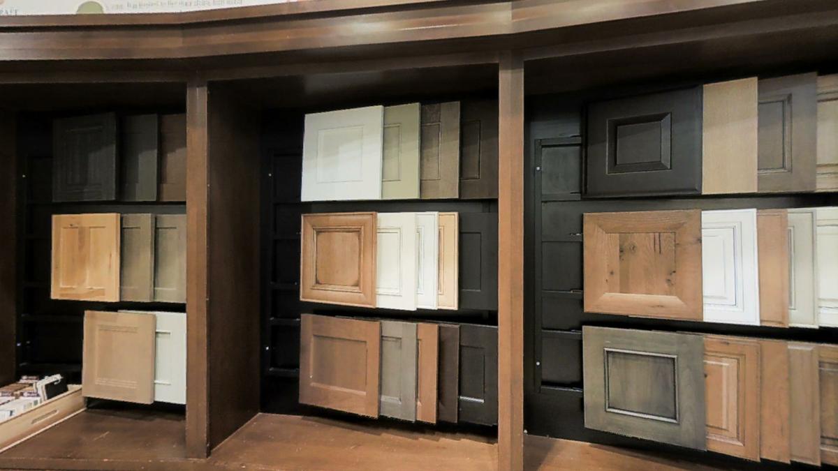
design center 4When you start planning your new Fulton Home, it may seem like the kitchen is the most challenging part of the process. But once you make a couple of choices, your other options will begin to fall into place.
The best way to attack your overall kitchen design is with your cabinet style and finish. Do you want a contemporary look? Then consider the Shaker style for your cabinetry. This sleek style, shown on the bottom middle in the photo above, works well with the sleek lines of a contemporary home.

If you prefer a more country or rustic look, why not consider a glazed finish such as the cabinet door shown on the lower right? The darker tone and contrast provided by the black glaze makes that cabinet feel more homey and inviting, a fitting style to give that farmhouse appeal.

Perhaps you want to go solidly traditional. The dark cabinet door on the upper right would work well with any traditional decor. A light and bright kitchen would work well with the middle cabinet door to the left of the photo. The good news is that the Fulton Design Center has a rich selection of choices in cabinetry, and all of them in a standard of quality designed for you to enjoy in your new kitchen for years to come.

We encourage you to visit the Fulton Design Center to see our choices of kitchen cabinets in person, to start the process of designing the Fulton Home of your dreams.

Creating the Perfect Kitchen for You

design center 2What would your perfect kitchen be like? Would looks or functionality be more important? Do you want great cabinets or would you compromise on that to have just the right appliances? Could you live with a smaller refrigerator as long as you have a gas range? Well, when you walk into the Fulton Design Center, those may be the decisions you will face, so it pays to think about them now.
Start by taking a look at your current kitchen. Would you like more cabinet space? How about better lighting? Do you like your current cooktop or do you want something different? How much countertop space do you have now? Could you use more? When you think about what you want in a new kitchen, analyzing your current kitchen is a good jumping off point.

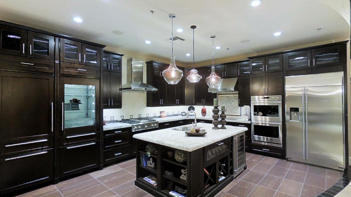
Next, visit the Fulton Design Center during one of our browse nights. Spend time in the various kitchen vignettes like this one. Take the time to see which kitchen feels the most comfortable for you. Are you drawn to the rich dark finish of these cabinets? Or maybe you’ll find you prefer the lighter tones of one of the other vignettes. Spend some time standing and looking around at the various choices. They’re designed to help give you ideas for your own home.

Finally, check out all of the options available. Some might be a good fit for your approach to cooking. Others may be unnecessary. Don’t project your dream of becoming a gourmet chef onto your kitchen if you know you specialize in tuna casseroles. On the other hand if you like hanging with your kids after school while you fix dinner then you probably want that island extension that gives them space to sit and chat with an after-school snack.

Whatever kitchen you create, we know it will be just as perfect  for yourself and your family as your new Fulton Home will be for all of you!

Making the Most of your Walk-In Pantry

wWarner-Groves-at-Morrison-Ranch-053 - CopyIf you’re lucky enough to have a kitchen with a walk-in pantry, you will soon wonder how you ever managed to make meals without one. It can’t be beat for helping you organize your space and make the most of your kitchen. Here are some suggestions to help your pantry really work for you.
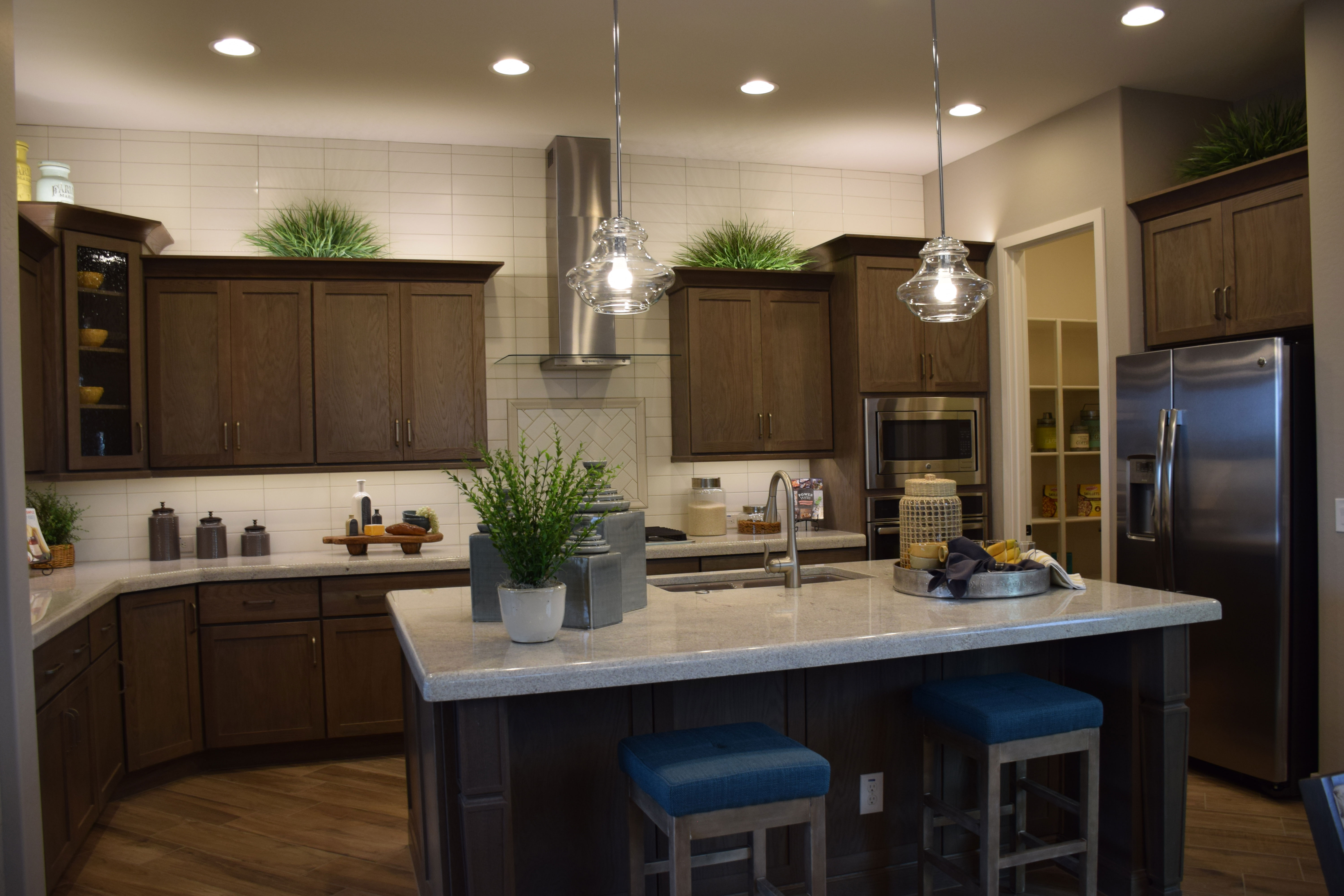
Use a FIFO inventory system: FIFO means First In First Out. If you don’t pay close attention to this, it’s easy to let food get lost until it’s out of date. To protect against this, keep like products together and take the time to put the new purchases toward the back.

Use baskets to store small products: Packets of spice mixes or dips will quickly get lost on shelves if you don’t keep them contained. Look for small wicker or plastic bins to hold this type of item.

Store small appliances on lower shelves: It’s easy to have small appliances such as blenders and food processors absorb counter space. Instead, use your lower pantry shelves to store those appliances, keeping them out of the way yet making them easy to grab when you want them.

Use labeled clear airtight bins to store grains and staples: Oxo and other companies make great airtight bins for flour, sugar and cereals. You can use a label maker to print labels or just tape hand-written labels on the fronts of the containers. These are much more efficient in terms of space usage and will keep everything fresher than leaving things in original boxes.

Position a grocery list in your pantry: As you run low on standard pantry items, add them to your list. When you’re ready to go to the store, just add any fresh produce or meat needs and go.

With a little planning, your pantry can be the center of your well-organized and enjoyable kitchen.

Modern & Traditional Kitchen

wWarner-Groves-at-Morrison-Ranch-007If you’re having trouble deciding whether you want a modern kitchen or something more traditional, you might want to create a kitchen like this one. It combines the best of both worlds.

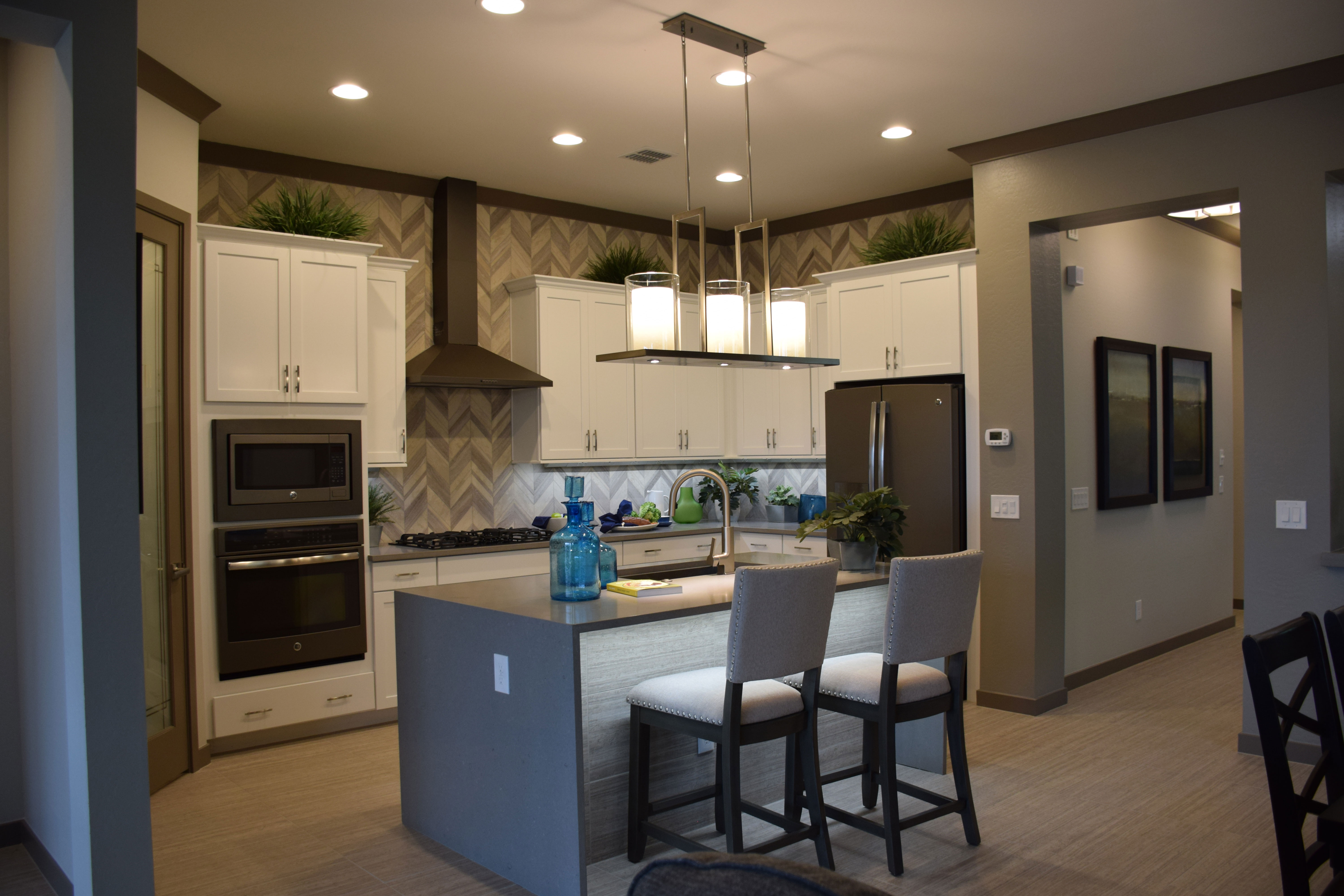
It’s easy to spot the modern touches. The island with its solid-surface design demonstrates clean lines and an inviting profile. The light fixture hanging over it also sports a clean style and interesting approach. Slate appliances show the newest finish with a contemporary flair.

The choice of tile set in a chevron pattern matches current patterns, and the grey blend of colors is completely today. Add in the sleek profile of the vent hood and you have the picture of a modern kitchen.

And yet traditional elements also play a part. Notice the crown molding on both the cabinets and around the ceiling. These choices add a reminder of another time while softening the modern aesthetic a bit. The padded chairs at the island also have a traditional profile, although the grey upholstery and dark wood work with a contemporary approach too.

Painted wood cabinets were common at one time, and today they still help to create a light and bright kitchen that works with both modern and traditional styles. They provide a bit of a farmhouse feeling.

One final traditional element comes in the accessories. The blue glass apothecary jars echo a feeling of yesterday. Altogether, the space shows an eclectic mix that takes advantage of the best of both perspectives. So when designing your own kitchen, don’t get trapped in one specific look. Instead create an approach that works for every element of your taste.

Granite Adds Color to Kitchen

Cooley-Station-106web
If you’re drawn to painted cabinets in a kitchen but worry that there won’t be enough color with your choice, take a look at this option, from the Surfliner model at Cooley Station. The cabinets are white, the appliances stainless, but this kitchen is anything but bland thanks to the dramatic granite countertop.

With every Fulton Home, granite countertops are standard in your kitchen. This choice is perfect with white cabinets. First, there is enough light color in the stone to connect the countertop with the cabinetry, yet there is still enough contrast to be effective. The natural brown and gold elements warm up the space, filling in the tones normally provided by stained wood cabinets.

Notice how the tile work stays light, but adds a rustic charm to the space with its beveled edges and trim. The dark mosaic tile elements over the stove and along the middle section of the island add an interesting dark contrast.

The dark flooring brings out the darkest brown visible in the countertop, connecting everything in the kitchen together. A few touches of black – the sink, the burners on the stove, and some accessories – pull in some additional strong dark tones.

This kitchen doesn’t really need a lot of additional color. A bit of maroon from the bar stool cushions and coffee cups are all that it takes to finish off the look.

Is this the kitchen of your dreams? Come take a look at this choice and more at our model homes at Cooley Station. Visit FultonHomes.com to learn more.


White Cabinets Make a Bright Kitchen

Cooley-Station-106webThere are as many options for kitchen styles as there are cooks. Many people love a dark Tuscan look, with cabinets in a rich stained wood and darker countertops in stone that echo an old-world look. Others lean toward a contemporary option that includes lighter stained cabinets and a solid-surface counter.

But if you want your kitchen to capture a bit of a farmhouse feel while staying light and bright, you may want to consider painted cabinets. This kitchen’s cabinets are ever-so-slightly off white, which provides a cheerful mood.

Notice that overall this kitchen’s other elements keep the painted cabinets from feeling bland. The rich gold granite countertops add enough interest and contrast to make this kitchen pop. And the darker mosaic over the stove adds another inviting element of contrast.

With this light a kitchen palette, the choice of darker flooring is smart. It grounds the room with its strong contrasting element while encouraging the lighter choices to shine. Maroon leather-topped stools and other maroon accessories also contribute to the sophisticated color choices of this space.

Notice the glass door on the corner cabinet. While many people would rather not have a lot of glass doors in order to hide not-quite-tidy cupboards, one glass door adds a special charm to any space. This is the perfect spot to showcase glassware or nice serving pieces.

So when you’re planning your kitchen, don’t just skip over the painted cabinets. Consider whether they would fit the kind of kitchen you want – light, cheerful and bright on even the darkest days.