 When displaying anything – accessories on a side table, a buffet for a party, birthday or wedding presents, the impact is much stronger if you vary heights.
Designers know that getting the right balance of heights makes any visual more dramatic and interesting.
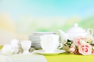
Let’s start with the photo above. The colors of pink and citrus green contrast nicely with the white china and the fabric to the left provides some textural interest. But notice that the difference between the tallest and shortest element is only a few inches. This pretty picture has charm but really doesn’t engage the eye.
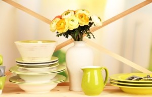
 In contrast, take a look at the photo to the right. The colors are actually slightly more limited, but the eye flies across the image thanks to several design choices.
To begin with, the height differential is almost a foot between the lowest and highest elements. The crossed ribbons in the background emphasize the height differences while pulling attention from one part of the image to the next.
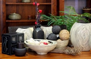
 Now you may have no reason to stack your plates and bowls, but you can use this same concept with accessories in any part of your home. In this last photo, the same concepts are applied to the accessories on a side table.
The grasses lying horizontal against the table are over a foot lower than the red flowers that top the vertical vase. The chair backs and the bookshelf in the background provide strong horizontal lines, so the verticals need to come from the accessories.
Finally, notice how the plant provides some nice diagonals to draw the eye the same way the crossed ribbons did in the second photo above. The look is completely different, but the same design concepts combine to make both arrangements powerful and eye-catching.

