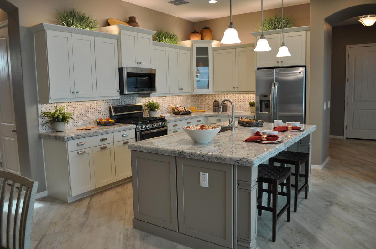
When you’re designing your new Fulton Kitchen, it’s worth considering painted cabinets. They add a light and inviting look to your food preparation space, and keep everything feeling light and bright. With lighter countertops and under-cabinet lighting like this kitchen in the Caravan model in Central Vermont at Cooley Station, the entire room is designed to create a supportive mood that makes it easy to spend time in this kitchen.
There are still a few darker elements for contrast, like the oven and microwave and the comfortable stools at the pull-up eating area on the island. Accessories also add nice pops of color. But the overall mood is light and easy on the eyes.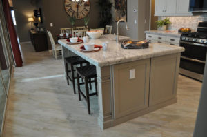
Notice how the accent wall, shown at the back of this photo going into the dining area, provides another contrasting element. At the same time the white dining chairs connects this space with the kitchen.
This is a smart connection between the two spaces, linking them both while still providing a source of much-appreciated contrast. The darker wall also supports a cozy ambiance which is appreciated in a dining space. Notice also the colorful tablescape where the accessories link it to the island. These choices make a home look more like a designed space rather than creating a more scattered feeling. 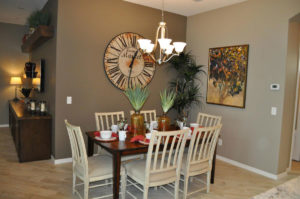
Don’t be afraid to mix dark and painted wood. You can see how well it works with this dining table and chair set. The shabby-chic effect on the painted chairs keeps them from seeming too matchy-matchy with the cabinets while still creating a link. While the painted chairs bring the painted kitchen cabinet feel into the space, the dark stained wood echoes other pieces used in the rest of the home. This type of mixing allows you to add just a few new pieces without having to discard the bulk of your furniture if you choose to go in a different style or color direction with your new home.
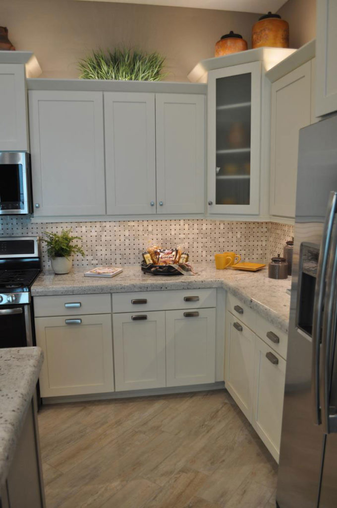
Take a look at another way this kitchen provides contrast without going dark. The addition of one glass-fronted cabinet in the corner adds a welcome and interesting break in the line of top cabinets. Both the height difference and the contrast of the glass add a welcome change in the design. And limiting the glass front to only one cabinet is also a smart budget strategy, because window doors are more expensive. They also require you to maintain tidier cabinets, which can be a nuisance.
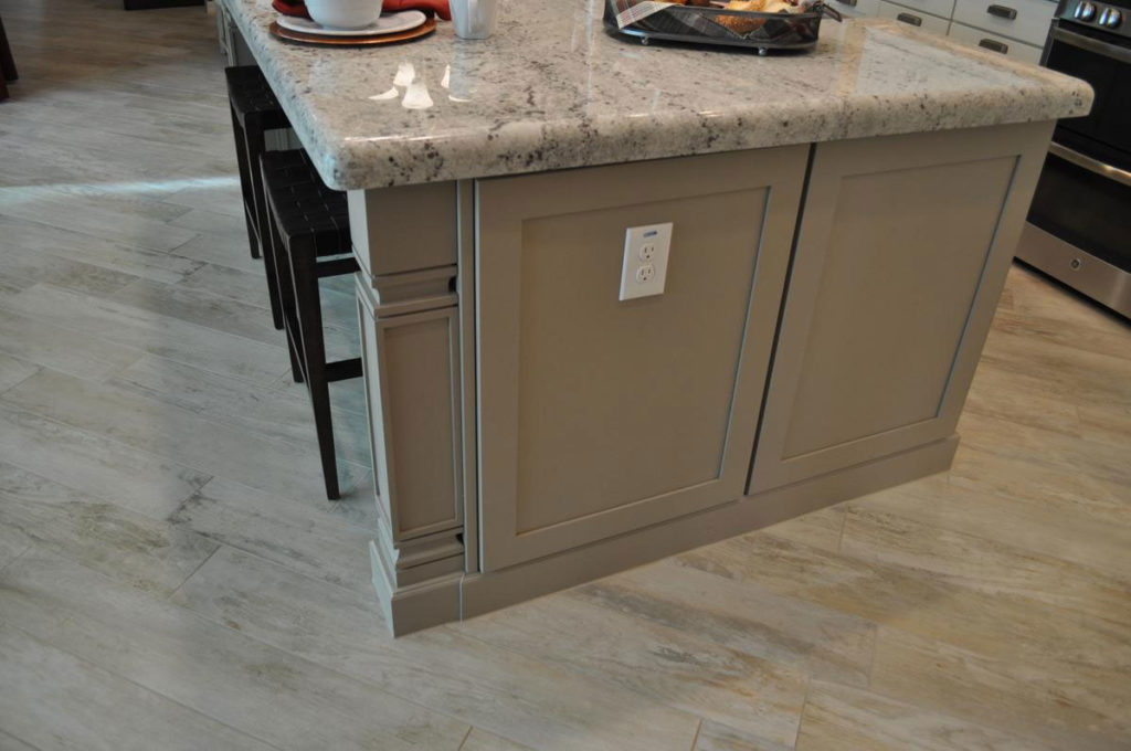
In another opportunity to add an interesting contrast, the island is a soft grey/taupe rather than white. This color works well with the chosen countertops and the flooring, yet it helps the island feel like something special. Choosing a different cabinet color for your island is daring, yet as you can see it can work well.
One reason this color choice works is because the same taupe is echoed in the kitchen’s backsplash. If you notice, the mid-range tone is a close match for the island cabinet color. When you can find ways to make those kinds of connections, you will end up with a kitchen that feels integrated and well thought out.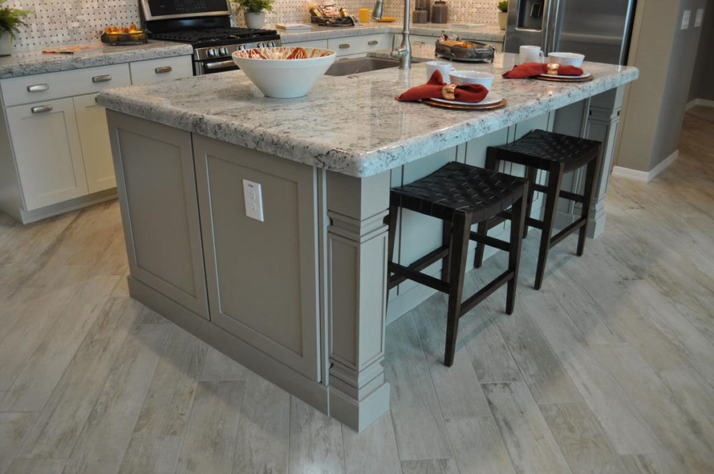 It’s interesting to realize that there are actually three fairly strong patterns present in this kitchen: the flooring, the countertops and the backsplash. You can see all three in the photo above. This could easily feel like too much if the contrast within or among the patterns was stronger. Imagine these same patterns in vivid reds and oranges! But because they are all gentle and light in color, the number of patterns isn’t overwhelming. In fact, you almost need these patterns to keep the kitchen interesting. In a way, the patterns take the place of a stronger light/dark contrast you would see in some other kitchens.
Here’s the final interesting design decision with this light bright kitchen. The rest of the open floorplan was designed to focus your eyes in that direction. The diagonal flooring draws the eye toward the kitchen, and the brightness of the space contrasts with the mid-range colors of the dining and family room to draw you toward the light just like a sunflower turning to face the sun. 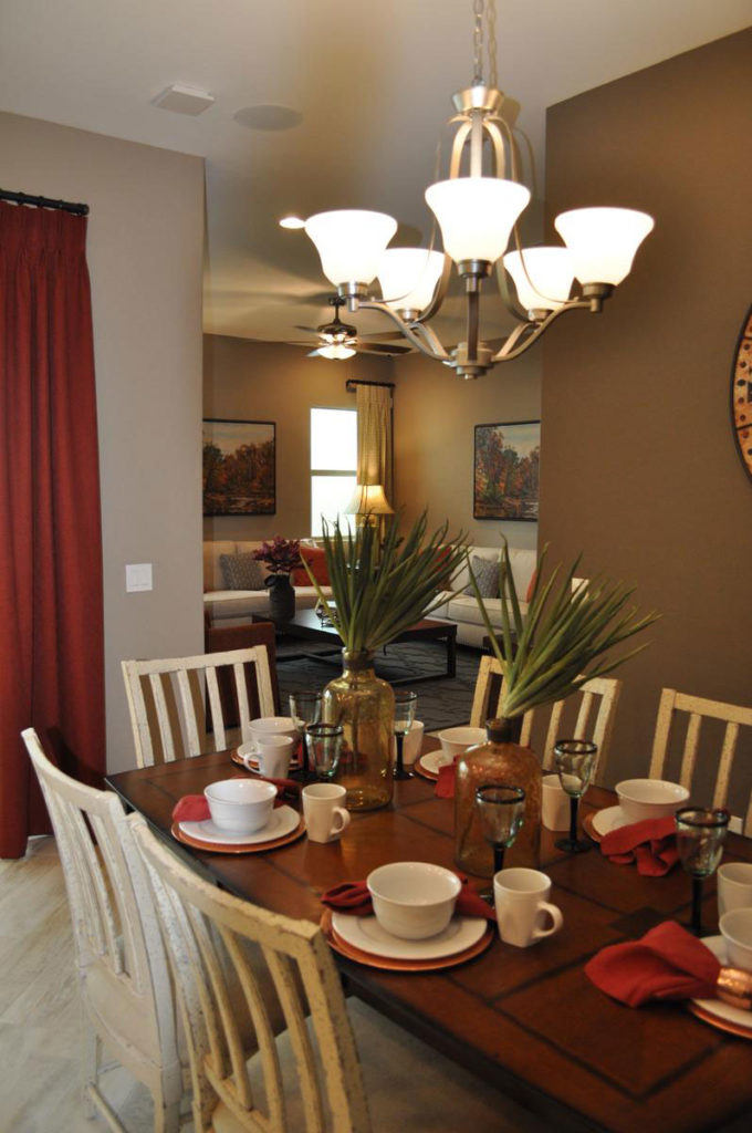
The rest of the home is warm and welcoming, with other white elements that mimic the light kitchen such as the sofas in the family room as you can see above. But linking it all, the heart of this home, is the light and bright kitchen, made for a family to live in, eat in, and spend time together in, and above all, enjoy. And that’s the best use you can make of a kitchen, isn’t it?


