 The guest bathroom generally gets the least amount of attention in a home. It’s the smallest room in your house, and your focus when you’re planning your new home is on your kitchen first, and then on your master bathroom and other areas where your family will be spending a lot of time. It makes sense to place the guest bath at the end of your list of priorities.
But if you think about it, chances are almost every visitor to your home will see your guest bathroom at some point. So it has a direct affect on how they view your home. And this is actually the most cost-effective room to create design drama, because the space is so small. A minimum investment can provide the maximum design impact. Let’s take a look at some of the guest bathroom designs in recent Fulton Home models to get some ideas of approaches you might want to take to give your guest bath some extra style.
First Impressions: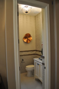
Think about what your guest bathroom will look like from the hallway. Even if your visitors don’t actually use the bathroom, they will probably walk past and glance in. That first impression will have an effect on the entire hallway.
In this photo to the right, the eye is automatically drawn to the copper artwork on the far wall. Other features such as the tile and the mini-chandelier come into focus later. Altogether this is a luxurious and well-integrated guest bathroom.
This first bathroom involves a serious investment in options to create a feeling of luxury. This was appropriate as it was part of the Legacy series of homes, which was a luxury line. But you don’t need to invest as much in options as was spent in this model to create drama.
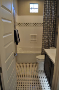
Take a look at the guest bathroom to the left. The vanity is nice-looking but fairly straightforward with a sink embedded in the countertop. The tub and surround are a solid surface which is less expensive than tile. But the tile chosen for the flooring and the coordinated tile inset added to the solid surface in the tub surround makes this bathroom pop.
In this case creativity and thoughtful style take the place of expensive options to make this bathroom stand out. Add an interesting coordinating shower curtain and some towels to emphasize the contrast and you have a guest bathroom that shows your personality without a big investment.
Lighting: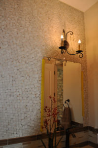
Because of its small size, smaller light fixtures can have a big punch in a guest bathroom. And if you want to take a chance with a different look, a guest bath is a great space for experimenting. The simple wall sconce on the right adds a touch of charm in a guest bathroom. After all, this is not a space where you need bright lights, and a gentle glow is flattering when people look in the mirror.
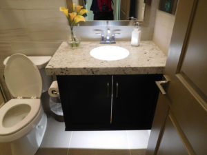
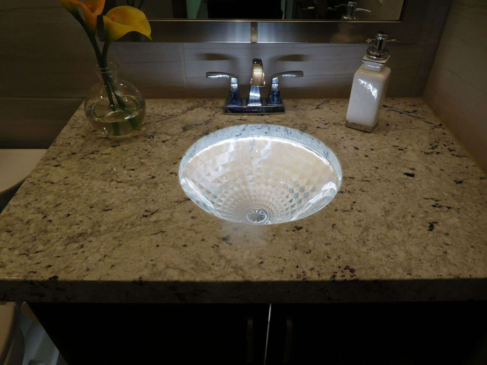
The photo on the left shows another fun way to use lighting in a guest bathroom. By adding a light under the vanity, the room doesn’t have a blinding glare when a guest hits the switch, and the look is unusual and interesting. In this case the sink is also translucent – notice the photo at the top of this blog – so the light also makes the sink glow. This choice gives you the opportunity to add some drama to your guest bathroom while not taking up any additional space.
Tile Trim:
Whether you choose a simple row of tile to outline your vanity or expand your tile choices to cover an entire wall, tile has a special place in many bathrooms. In the photo to the right you can get a closer look at the Legacy bathroom we visited above. In this case a full wall of tile is complemented with a rich row of glass tile trimmed with a darker border just above the vanity, serving as a backsplash. It provides the feeling of wainscoting and pulls every element in this room together. The border also adds some welcome contrast.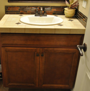
You don’t need to use this much tile to have a design impact in a guest bathroom. Take a look at the vanity on the left. The countertop uses a simple tile pattern to create a charming rustic feel. Then a six-inch backsplash of narrow rectangular tile picks up the tones of the vanity’s wood finish to create an integrated design element that makes this guest bath memorable. The oil-rubbed bronze hardware with its rustic flavor makes so much sense with this look.
Finishing Touches: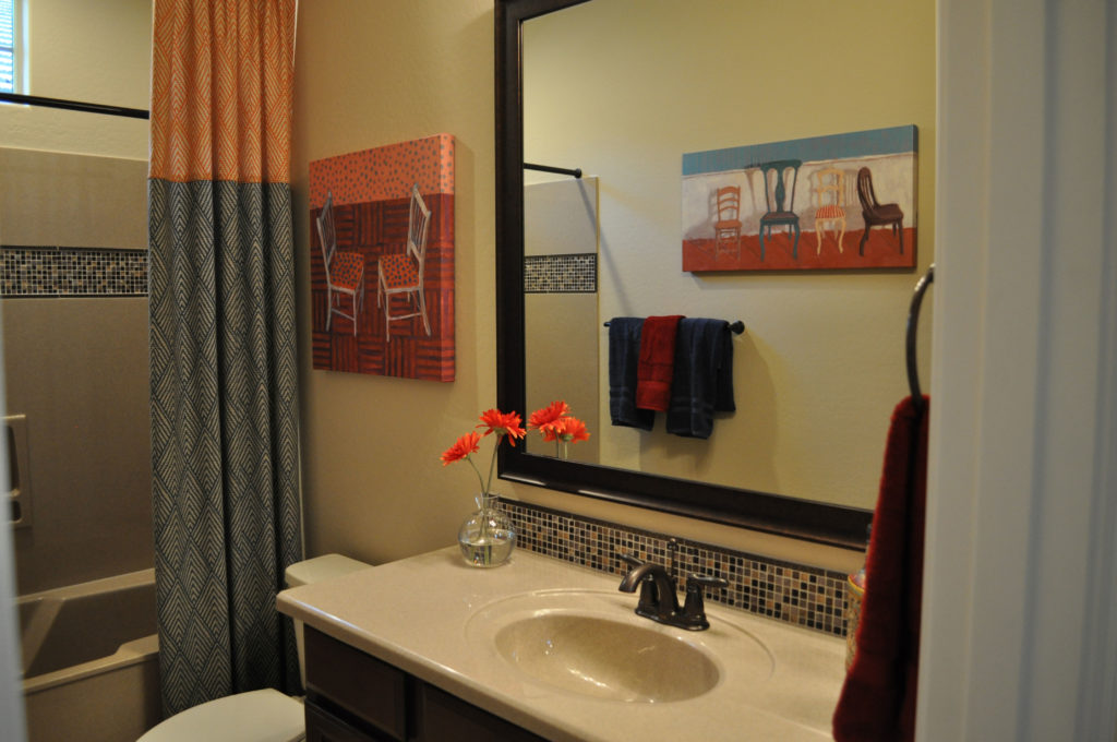
Don’t stop with the design elements. Once you move in, take the time to find the right art and accessories to complete the look in your guest bathroom. In the photo above, the design of the bathroom is enhanced by the choice of shower curtain, towels, art and accessories.
Notice that although the design itself is neutral, it left the homeowner open to introduce color into the room. By bringing in orange-red and the grey-blue, the neutral elements actually connect with the color palette. While you don’t need to be afraid to pull color into your design choices, if you would rather keep your permanent options neutral, think about what colors you will want to bring in with more temporary elements later. You may want to bring some of those colors with you to your design appointment.
Above all with a guest bathroom, have fun! It’s the smallest room in your home so it’s OK to take a few chances. And those extras aren’t going to break the bank with the minimum square footage involved. So as you wander through the Fulton Design Center, if you spot a special sink, faucet, tile design or light fixture you can’t resist, why not consider the guest bath for its home?
