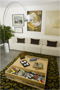
 This living room is an unusual combination of good design and design mistakes. Can you tell the difference?
Let’s start with what works. The sofa with its matching dark brown pillows combines perfectly with the art above it. Proportion and tone balances well. The plant to the left of the photo has just the right height to match the other elements. The lamp may feel too dramatic for some, but its height and the silver and stone material choices link the sofa with the concrete floor.
This type of floor will always work better with an area rug. However, the rug’s position isn’t the best for this space. Laying the long edge of the rug parallel with the sofa would make the proportions of the room more cohesive.
The most questionable piece is the coffee table. The light wood tone works in the space, but the over-large size and busy surface compromises the look of the room. First, setting the long edge parallel to the sofa along with the rug will make the proportions work better. Second, the kaleidoscopes scattered in the pocket in the foreground of the table look cluttered and confusing. The clean lines of the rest of the room are hurt by this design decision.
Although the kaleidoscopes add an element of whimsy, the visual simply doesn’t work. What could you do to change the impact of this choice? How about a fabric bag or other container to hold them? Or they could simply be placed in another room. A final option would be to select a rug with more color so that the splashy multicolored toys blend in better with the room.
By taking a look at rooms like this and determining what works and what doesn’t, you can make your own home design plans a success.
