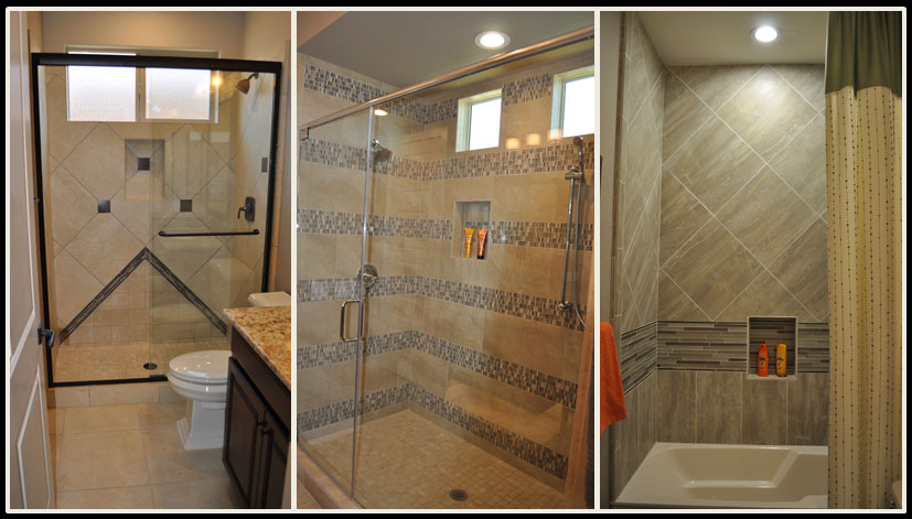
 When you combine tiles, panels, listelles and features such as nooks to hold shampoo and soap, your shower can be customized to just the right combination of style and function to suit you. All three of these showers are light neutrals, yet each one has its own personality and flair.
The one on the left uses a diagonal layout for the tile backing with dark squares adding contrast and interest. In addition, the arrow shape coming up from the floor keeps the look from being predictable. The dark vanity connects the rest of the bathroom with the shower, creating a strong integrated look.
The middle shower is generous in size, and that space is emphasized by the dramatic stripes created by an intriguing mosaic. Contrast comes from the random pattern of dark and light squares throughout the mosaic stripes. Your eye shifts from the smooth neutral provided by the plain-colored tile to the pop of personality in the mosaics. The two balance each other out.
The final photo shows a tub-shower combo. Notice that the niche for soap and shampoo is lower, so a bather doesn’t have to stand up to reach their beauty products. In this case one stripe of glass tile adds a pop, which is supported by the shift of the standard tile from a square set on a diagonal to a rectangle set upright. This trick subtly defines a cozy bathing area while taking a more expansive feel in the higher shower range.
Which shower would you pick? Or maybe your ideal shower would be completely different! You can see these and other shower ideas at Oasis at Queen Creek, or visit the Fulton Design Center.
