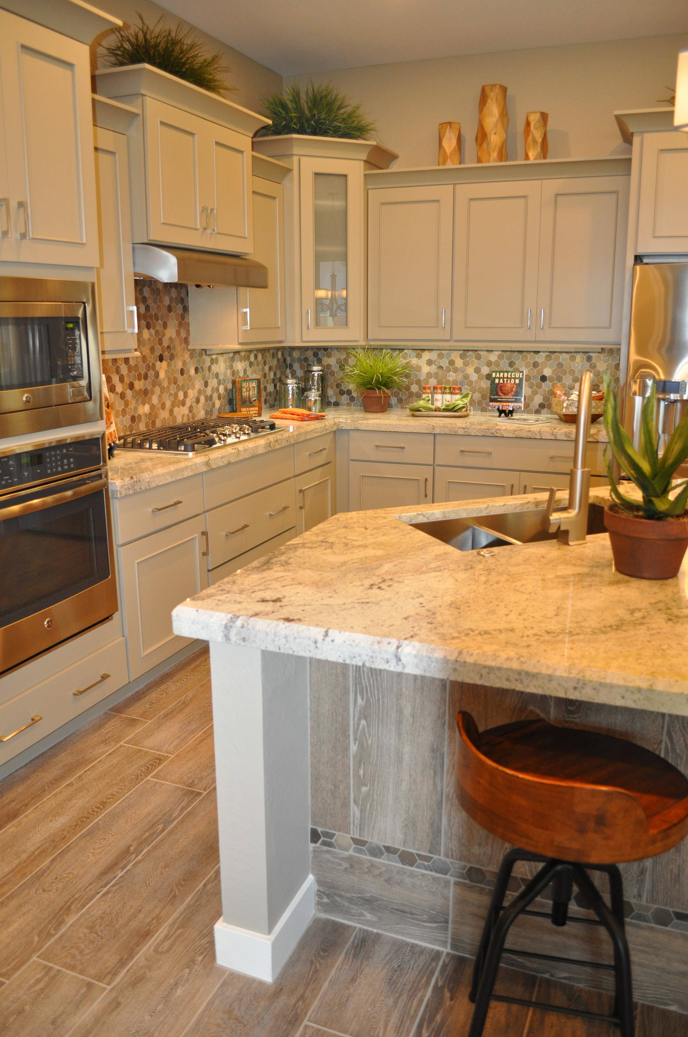
 What are you looking for in a kitchen? There are so many choices. If you want a light and bright kitchen, this one from the La Quinta model at Oasis at Queen Creek provides a great example. Let’s take a look at what makes this kitchen design work.
Painted cabinets: The look of stained wood is lovely, but nothing says clean and fresh quite like a white painted cabinet. The crisp color also creates a remembrance of kitchens gone by.
Light countertops: This light granite choice fits well with the cabinetry and the veining provides a gentle contrast. The edge treatment feels substantial and works with the crown molding at the top of the cabinets.
Light backsplash mosaic: By including white and primarily light tones in the backsplash, the bright impression is carried forward. Notice that there are a handful of dark tiles in the design. This contrast makes the backsplash more interesting.
Stainless steel and brushed nickel metal choices: By staying with the cool and crisp feel of stainless appliances and brushed nickel faucet and pulls it’s possible to provide contrast without going too far. Black appliances or oil-rubbed bronze metals would be too strong a conflict with the other choices in this kitchen.
Warm but light flooring: While this porcelain tile plank flooring is light, it also adds warmth with its wood-look. The tone works well with the kitchen, providing just enough dark elements to anchor this flooring in the room.
You can make a careful balance of choices to create a light, bright and inviting kitchen like this one. To see it in person, visit our models at Oasis at Queen Creek.
