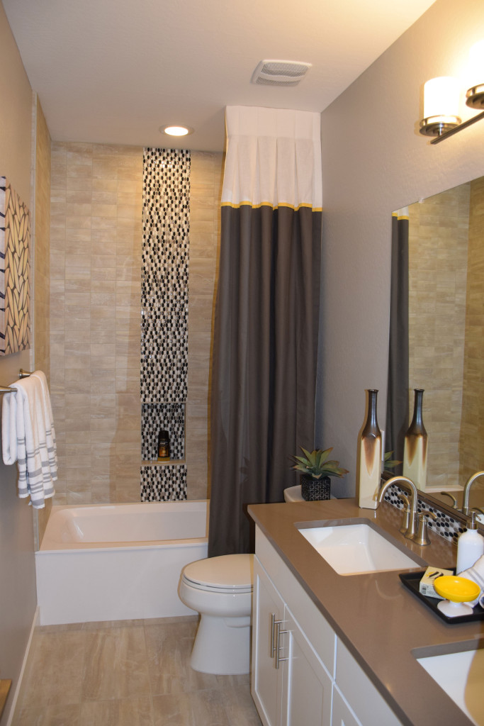
 Smaller spaces can capture interest with just a couple of daring design decisions. This bath, from the Marquesas model at Ironwood Crossing, has all the elements of a good design, particularly given the available space. Let’s take a look at why this bathroom works so well.
Make a splash with mosaic tiles. By choosing to position a stripe of highly contrasting tiles in the shower surround, this bathroom moves from blah to drama. Notice that the mosaic is repeated on the vanity backsplash. This shows a consistency of design and connects the two pieces – vanity and tub – together from a design standpoint.
Match flooring and tub surround materials. When working with a smaller space, using similar colors and textures for large surfaces help the room feel bigger. This choice has personality but doesn’t overtake the room.
Pull from a consistent color palette. In this case, white, taupe and cool browns integrate well with each other making this bathroom feel like a well-crafted unit.
Stay contemporary with clean lines. When your space is smaller, the simple lines of modern styles are less distracting. Your eye moves easily from one element to the next, making the room flow.
Add a few sophisticated elements. The color-blocked shower curtain adds an element of style that complements the mosaic. Altogether this is an interesting and inviting design.
Choose one accent color that pops. Notice the small elements of bright yellow in this room. The oval soap dish toward the front of the photo gets an echo from a thin yellow stripe on the shower curtain. Adding just one or two items in a signature accent color add a spark to this well-designed space.
