 When you’re looking at the grammar of design, phrasing is all about creating moments of charm that capture the eye, just like a phrase in a sentence or a paragraph will capture your attention.
This bright red bench shines against the white and dark teal wall, while the red tile pillar brings the bench closer to the background. The grey stones with the little bit of green moss separating them provides a great contrast to the red. This is a well-phrased space.
 Design phrasing is as much about the space between elements as it is about the moments of charm themselves. Too much stuff and the message can be lost in the abundance of words, or items. The eye needs white space, on a page or in a room.
Take a look at the children’s room to the right. While it appears cute at first, there are no places to rest the eye among all of the colors, designs and textures. There’s a lot of stimulating things to look at, but no place for your eyes to take a break. It’s simply too busy.
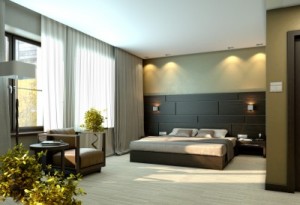
 The bedroom shown on the left, on the other hand, uses design phrasing very well. The bed represents one phrase, with light bedding contrasting well with the dark wood wall behind it. Matching sconces and nightstands create a symmetrical presentation that is easy to read and draws the eye.
Another phrase comes from the upholstered chair with a side table and plant. The curtains connect the bed and chair, but they are neutral and undemanding enough to provide a break in the room. The flooring and the ceiling also provide good visual breaks in the room.
If you think of designing a room as a way to create and separate phrases of design, you will find yourself with a space that is both interesting and relaxing. How does the phrasing work in your home?
