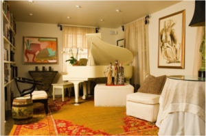
 What makes this room so inviting? It certainly breaks more than one design rule. The furniture is too big and crowded for the space, seating is limited and not set for conversation, and colors are all over the map.
This room demonstrates that sometimes rules are made to be broken. It is so individual and almost quirky that it’s more about the people who live here than about design, and that’s alright.
Even if you are not inclined to create spaces as unique as this, you may find some ideas about breaking the rules that you can borrow from this room. First, the large rug overpowers the flooring, but this can be a good thing. If you are not ready to replace flooring in a room but it doesn’t work with your taste or color preferences, a rug like this can change the flavor of a room instantly.
Next, let’s consider the use of color. The rug and painting on the far wall have vivid colors that take over the color palette of the room. However, much of the furniture is neutral. By choosing white and black for the larger pieces, the smaller elements can carry some color without overwhelming the room.
Next, accessories have a particular place in this space. Take a look at the three figures in front of the piano. They are unusual and intriguing. Their position in the room gives them star status, and the white stand and piano behind them supports this. Sometimes a special piece of art or sculpture deserves center stage, as in this case.
Yes, this room breaks rules, but it does it in the right way. So don’t be afraid to step beyond the traditional standards of design to create a room as vivid and interesting as this one.
